tldr: get application entry points and screen rendering under or as close to 250ms, with a goal of 100ms rendering from user interaction.
Preamble
We have a goal of the application feeling production ready by the end of Q2, so Status can support the go to market strategies of Keycard, Teller Network and the SNT Utilities.
The keyword here is feeling. We’re a consumer facing application and how a user feels, how you feel when interacting with the application, matters.
It’d be amazing if we can raise this in our collective consciousness and ensure this is continually a priority moving forward.
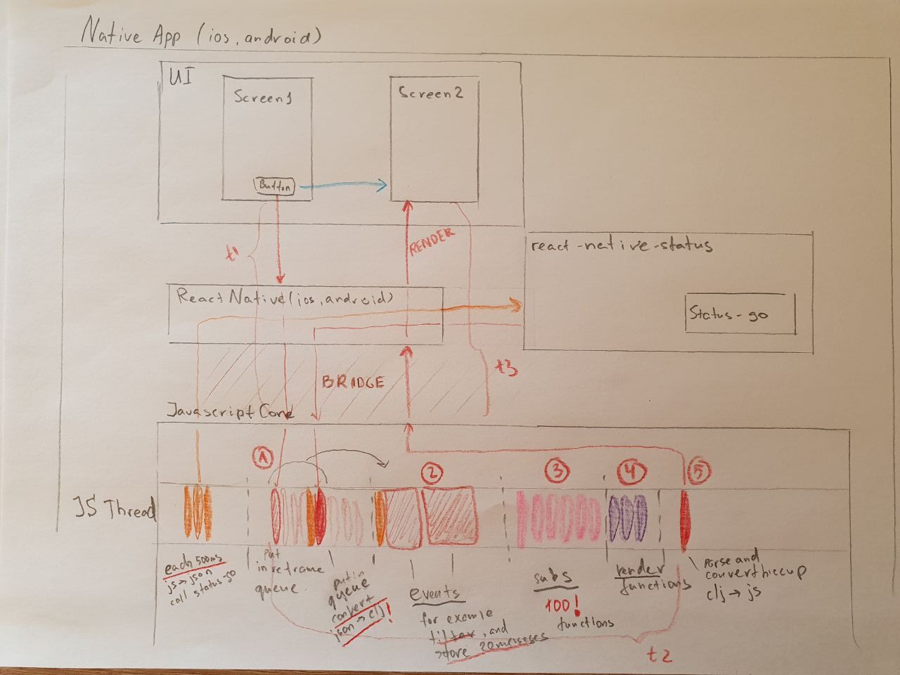
Timing is Everything
Status faces substantial issues in rendering screens and loading in information, below I present 4 real world examples that demonstrates some of the worst offenders from my personal experience.
When it comes to protocols and UX, Status should be delay-tolerant and ‘offline first’, decoupling the retrieval of new information from the display of information the client already is aware of, and what it knows is incoming.
When it comes to rendering screens and entering the application, latency between user input or interaction should be kept to a minimum, it seems humans are capable of identifying visual stimulus changes around 50ms, while cognitive processing for reaction to visual stimulus happens around 250ms.
While user’s upper threshold for waiting for new information is about 10 seconds.
Unfortunately we are a far cry away from any of these user expectations.
I strongly recommend everyone reads the links below, there’s plenty of recommendations. To keep things convenient for the reader here’s some quotes to demonstrate impact:
[Google found that] the page with 10 results took 0.4 seconds to generate. The page with 30 results took 0.9 seconds. Half a second delay caused a 20% drop in traffic. Half a second delay killed user satisfaction.
In A/B tests, [Amazon] tried delaying the page in increments of 100 milliseconds and found that even very small delays would result in substantial and costly drops in revenue.
The 100 ms threshold was established over 30 yrs ago. See:
Card, S. K., Robertson, G. G., and Mackinlay, J. D. (1991). The information visualizer: An information workspace. Proc. ACM CHI’91 Conf. (New Orleans, LA, 28 April-2 May), 181-188.
Miller, R. B. (1968). Response time in man-computer conversational transactions. Proc. AFIPS Fall Joint Computer Conference Vol. 33, 267-277.
Myers, B. A. (1985). The importance of percent-done progress indicators for computer-human interfaces. Proc. ACM CHI’85 Conf. (San Francisco, CA, 14-18 April), 11-17.
Real-world Examples
The below scenarios are a daily occurrence for me. This is my real-world experience, I made an attempt to preserve some privacy by blurring some UI elements, however it may not be the case that I covered it entirely and apologize in advance.
When it comes to feeling, when using Status I observe within myself strong emotions of frustration and find Status tedious to use, which is further compounded with message reliability issues and little meaningful feedback on message delivery. I probably wouldn’t use Status if I wasn’t working on it, nor do I expect others to.
Cold Boot & Initial Sync
First Impressions matter, opening Status is the most important entry point to get right, this is still quite slow (regression?), It takes 13 seconds from opening Status to rendering the initial chat list. The rest of the video is syncing and does not complete, this time the syncing took over 15 minutes with auto-mailserver selection.

App-Entry from Push Notifications
The next important entry point into the application is from push notifications.
First-time
It takes 13 seconds to render the wrong UI elements, an additional 7 seconds to provide an error (which has persisted for some months and doesn’t seem to impact the display of chat history, as I get this frequently). I left the application recording for 15 minutes without ever seeing the message.

Second-time
40 mins apart from the previous recording I attempted to view a new push notification.
Here it takes 9 seconds to render the wrong UI elements, an additional 8 seconds to show offline state and error. 27 seconds to show the message, and not the chat history.
Here we should be displaying the chat history and a placeholder for the new incoming message.

Slow-Rendering of Chat History
From opening a chat from chat list, it takes about 2 seconds to render the most recent page of chat messages.

Application Switching
Not recorded, but when switching the application from background to foreground on Android there is a consistent syncing period and the application is slow, even when there is no meaningful change to application state.
Bonus Points
-
Notice the sync bar animation jitter, while I don’t know how it’s implemented, could this animation be offloaded to the UI thread somehow? Are there more instances of this?
-
Redraws. @roman already did some excellent work on this and proved that redraws matter, the list scrolling performance has improved substantially. There are still many red patches in the application and it would be nice to minimise this further if possible.
-
the 9+ icons are essentially meaningless to me
-
i often never receive push notifications for new messages
Accountability & Responsibilities
It would be great if UX, QA and Core swarms, in that order, took on the responsibility to be accountable for ensuring that these issues and others like it are permanently resolved before the end of Q2.
I strongly believe that improving this will make Status a much more enjoyable experience and help users be more forgiving in our other shortcomings.
Thank-you