After spending some great quality time with Status people in Prague and Devcon being over, it’s probably a good idea to start talking about how to implement the ideas and thoughts we’ve discussed onsite.
While there’s a lot of great ideas on what we want to do, I think one of the things that needs much love is the overall appearance of Embark.
@cryptowanderer has already done amazing work in streamlining the new Status website (https://status.im) with all the Status related projects and initiatives (Studio, Nimbus, etc).
I think this is a very important thing to do as the first impression can be very crucial. Having a polished website with a clear language and outstanding documentation is super important to increase user adoption (as I’ve touched on in Status.app).
That’s why I’d like to see the same thing happening for Embark as well. I know this might not be the highest priority for most of the developers on the team, but I’d really really like to see a nice Embark Logo that will be consistently used across the board, whether it’s swag, the website, or anything else.
There’s already an ongoing effort by @Ned and @jonathan to create and implement a design language that is flexible enough to adapt to various projects inside and outside Status, including Embark. This effort will probably take some time until it’s ready to use, so until that happens, it’d be great to:
-
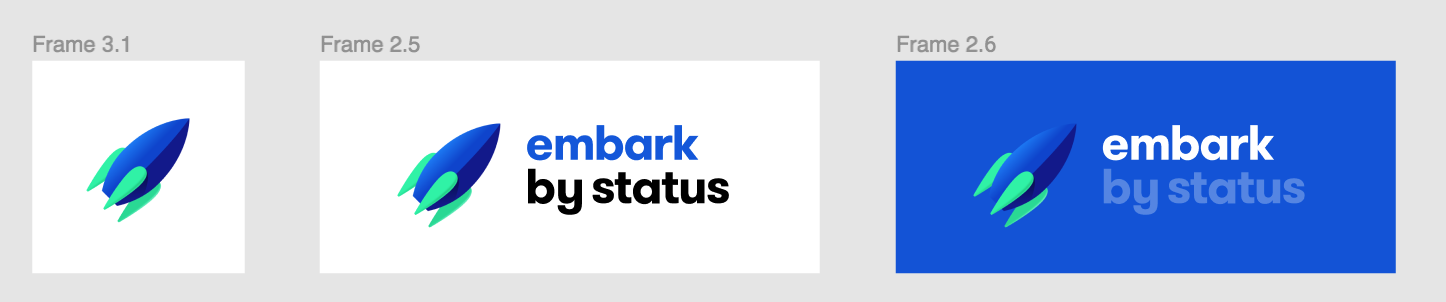
Make the current logo good enough - We can use the “new” rocket we have an fine-tune it if needed.
-
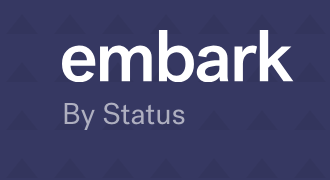
Add a “Font logo” as well. Right now all I’m I’m seeing is “embark BY STATUS”, but I’d rather like to see “Embark”. So if it’s feasible let’s remove the “by Status” part all together or at least make it very small.
-
Come up with a clear, short and concise tagline that represents the values of Embark. Right now it says:
Embark is a fast, simple and powerful framework to help you develop and deploy Decentralized Applications
I actually don’t think that’s entirely true. We are not a framework but rather a tool(belt). I think we should put emphasis on what we’re good at, which is flexibility. As you know, Embark goes far beyond deploying Smart Contracts. We should make that part of our identity as I believe not many people are aware of this.
-
Align our website with the new design. I know @cryptowanderer wanted to help with that or at least guide on that effort. It’d be super nice we could maybe also align this with the colors of the new rocket logo that we have.
-
Documentation - We do have quite some documentation, but I’m having the feeling that not everything is documented, plus there seem to be common scenarios that people run into that could be documented as well. I’m happy to drive this effort as I’ve been adding a lot to the docs lately anyways.
Again, I fully understand if and that most of the developers don’t see this as a high priority, which is why I’m happy to push the needed buttons to make this happen.
Is this something we could tackle in collaboration with people from design etc? I really want Embark to look cool and appealing to use for new users.