Hey there!
I want to report my user experience with the new status desktop beta.
Background: I’m a privacy aware user, been on Linux desktop for over a decade, running GrapheneOS on my phone. I’m pragmatic, meaning I go to some lengths to be digitally sovereign, without being super strict and suffering whatever it takes to be pure.
That said: I have first installed status in 2016 (I think it was an alpha then), remember that it took quite some effort, had to build it myself and install via adb.
But I liked the vision very much from the start.
But I never became a regular user of the App, because it never got to my UX threshold of good enough. E.g. no WalletConnect to make it usable with Dapps, tedious authentication, etc. Also the messenger feature is nice, but not of much use without network effects.
However I keep coming back every now and then in order to check the status quo, hoping to find it in a status which makes it good enough for me to be adopted.
Recently I downloaded the new desktop beta.
I want to report how that went.
After passing the ToS, I select “Import a seed phrase”. I copy’n paste the 12 words into the first field. Some wallets are smart enough to support that. Here it doesn’t work, I need to manually fill in the 12 fields.
I confirm.
It asks me for a profile name. Won’t accept the 4 chars.
I select something else.
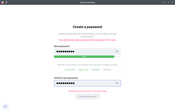
It asks me for a password.
I want to test drive the application, with a wallet holding few funds. Kind of a purse.
I’m using this on a notebook with full-disk-encryption.
I enter a pretty strong password more than adequate for the situation.
It is rejected, because it lacks 1 character, and lacks a symbol.
I’m annoyed, and a bit sad.
I remember that a few years ago I lost access to the status app because of the same problem: forcing me to come up with a new password, which I wouldn’t remember after a few months.
I won’t continue from here.
But I wanted to report. Provide a data point. Maybe it’s helpful.
PS: the UX of this forum is also bad. The registration confirmation mail arrived after a long delay. And the title must have 15 characters.
And: An error occurred: Sorry, new users can only put one embedded media item in a post.
