Rethinking the "Send transaction" flow + alternative confirmation options

Hey. After the latest discussion about the “Send transaction” flow i decided to do a few explorations.

The main goal was to create a unified flow which would be available from any part of the app: wallet, chat, browser etc.

Apart form that i wanted to fix some problems we’ve identified along the way.

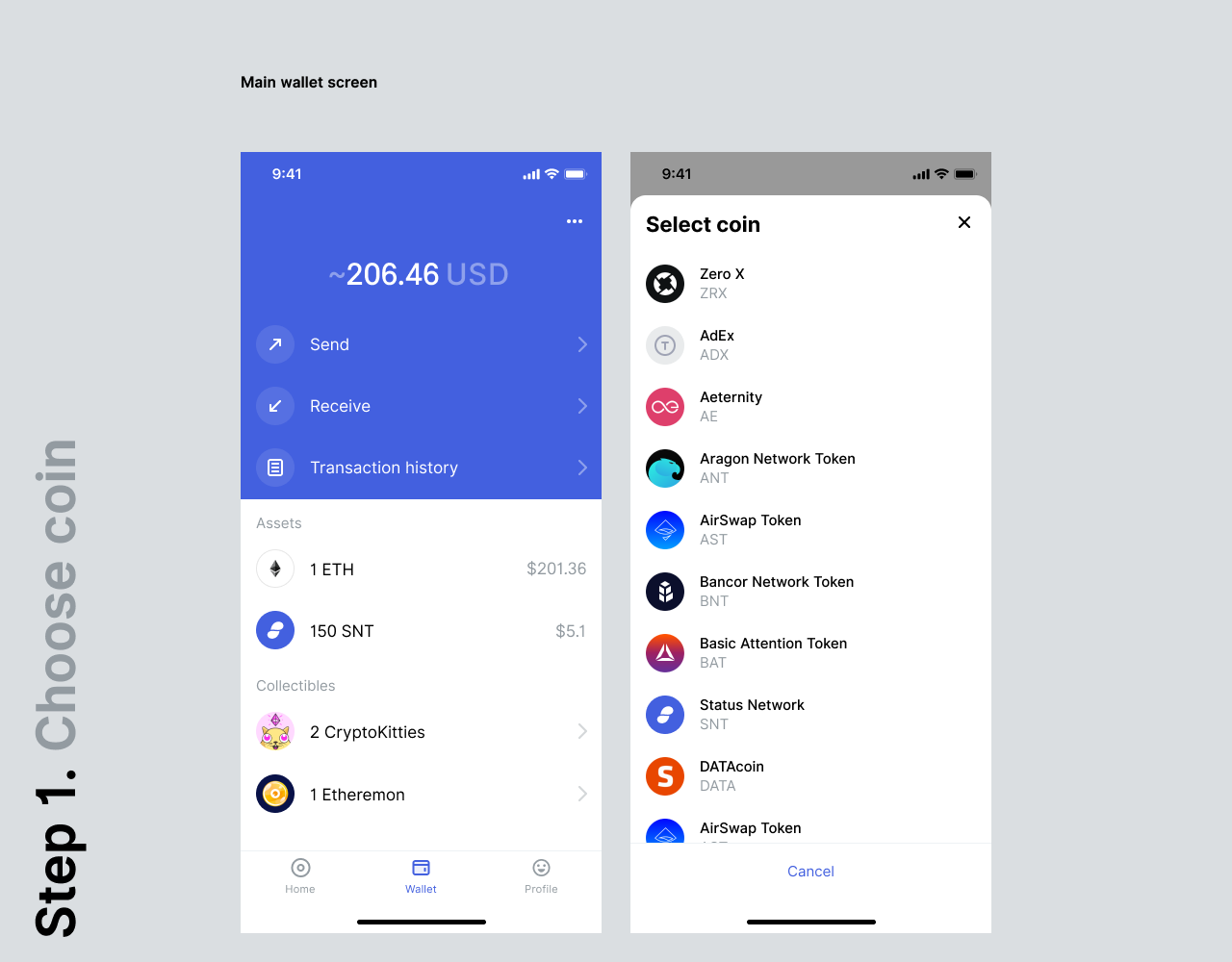
First of all i decided to separate the Choose coin and make it the first step of the flow. This makes sense because if you have chosen to send SNT it’s impossible to forget about it on the following screens, unlike recipient or amount.

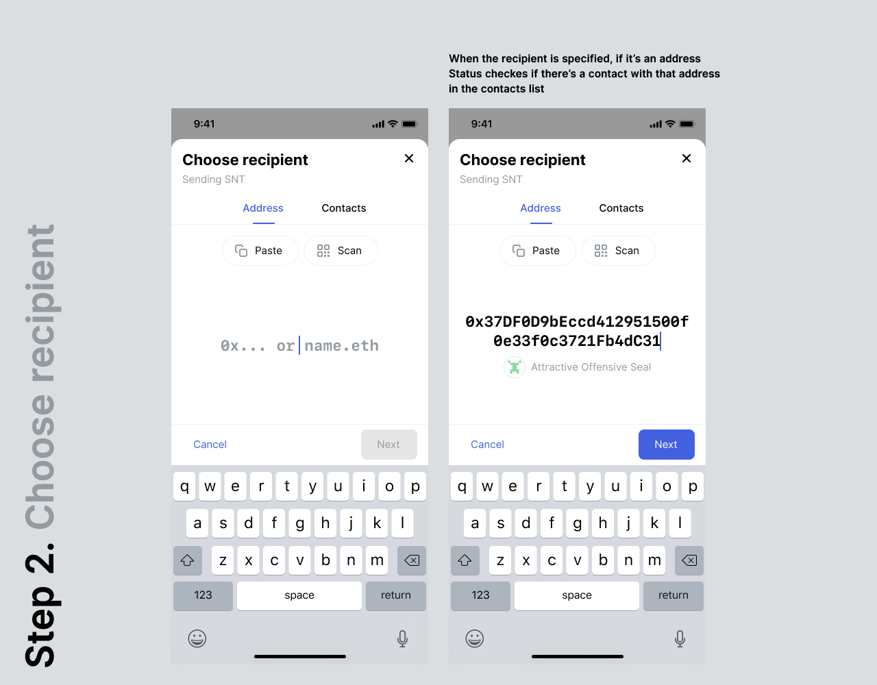
Choose recipient could behave smarter as well. For instance, it could fetch a the user’s name if they are in the contact list. Also, i’ve changed the layout and style of the “secondary” buttons (Paste and Scan) not to distract users from the main action.

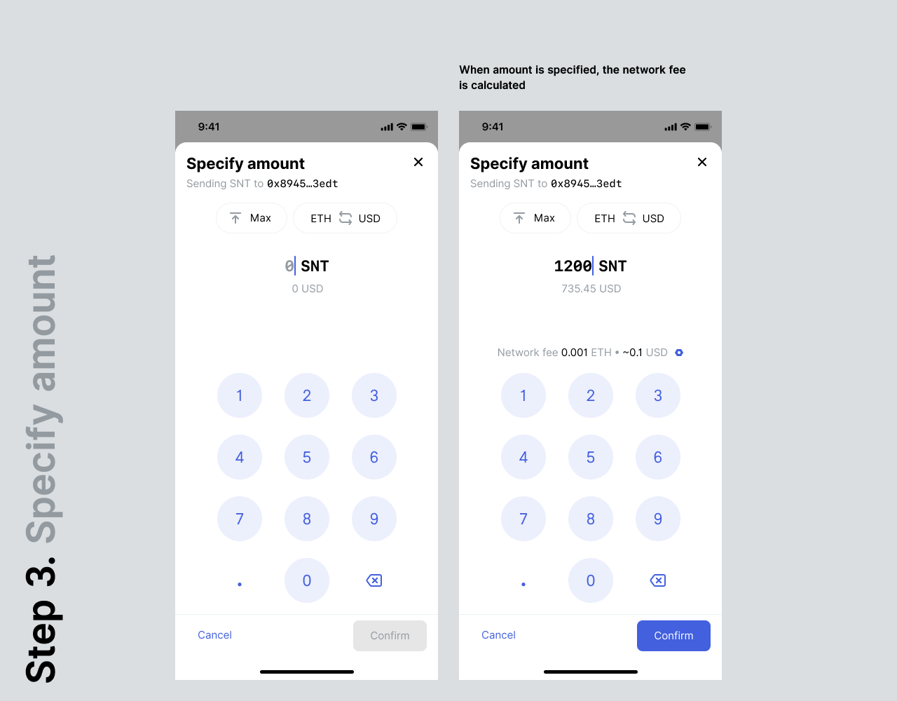
Specify amount screen now has a custom keyboard which we used in Tribute to Talk and it seems to be a more flexible solution than a native numeric keyboard. The layout of the secondary buttons remains the same as well.

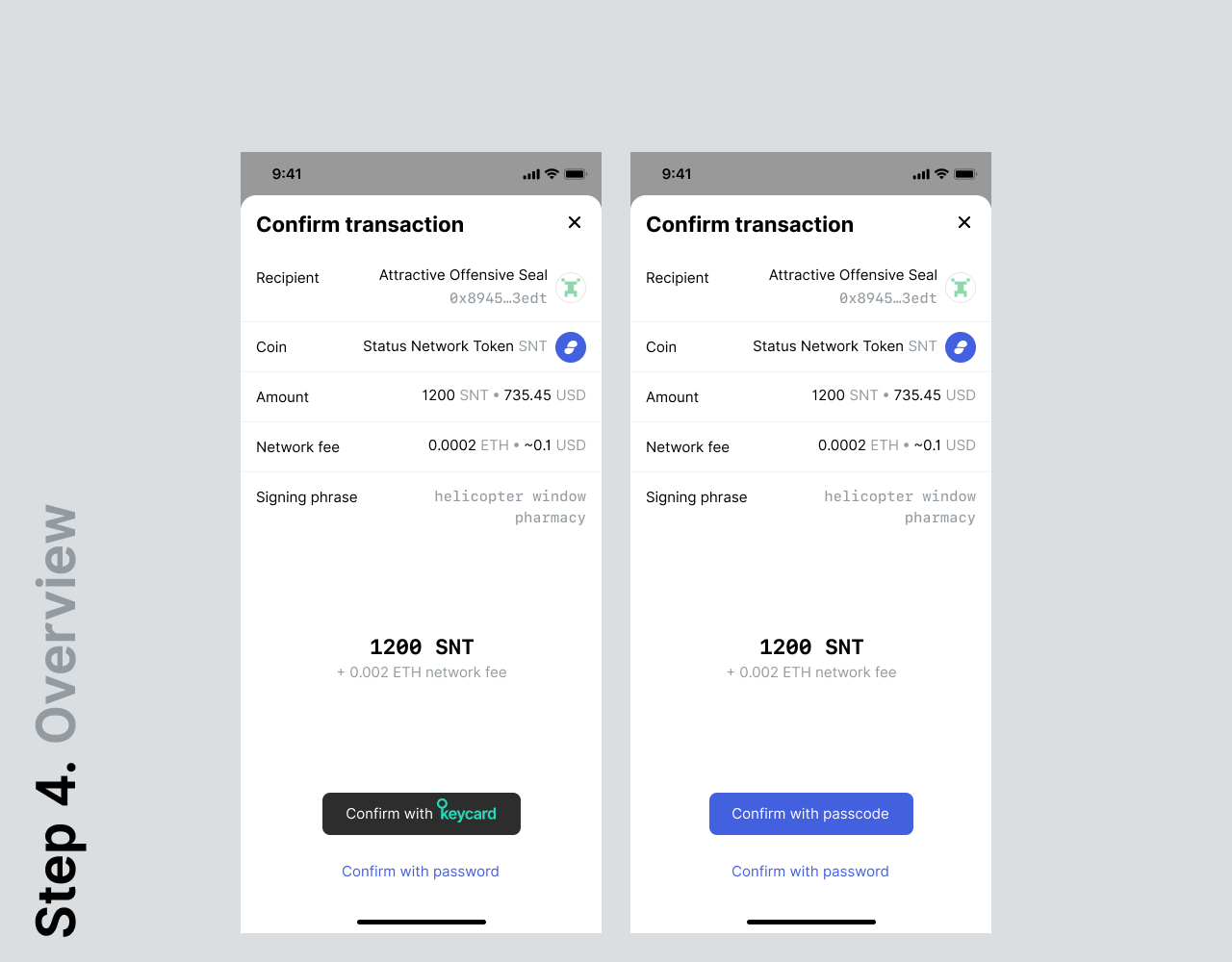
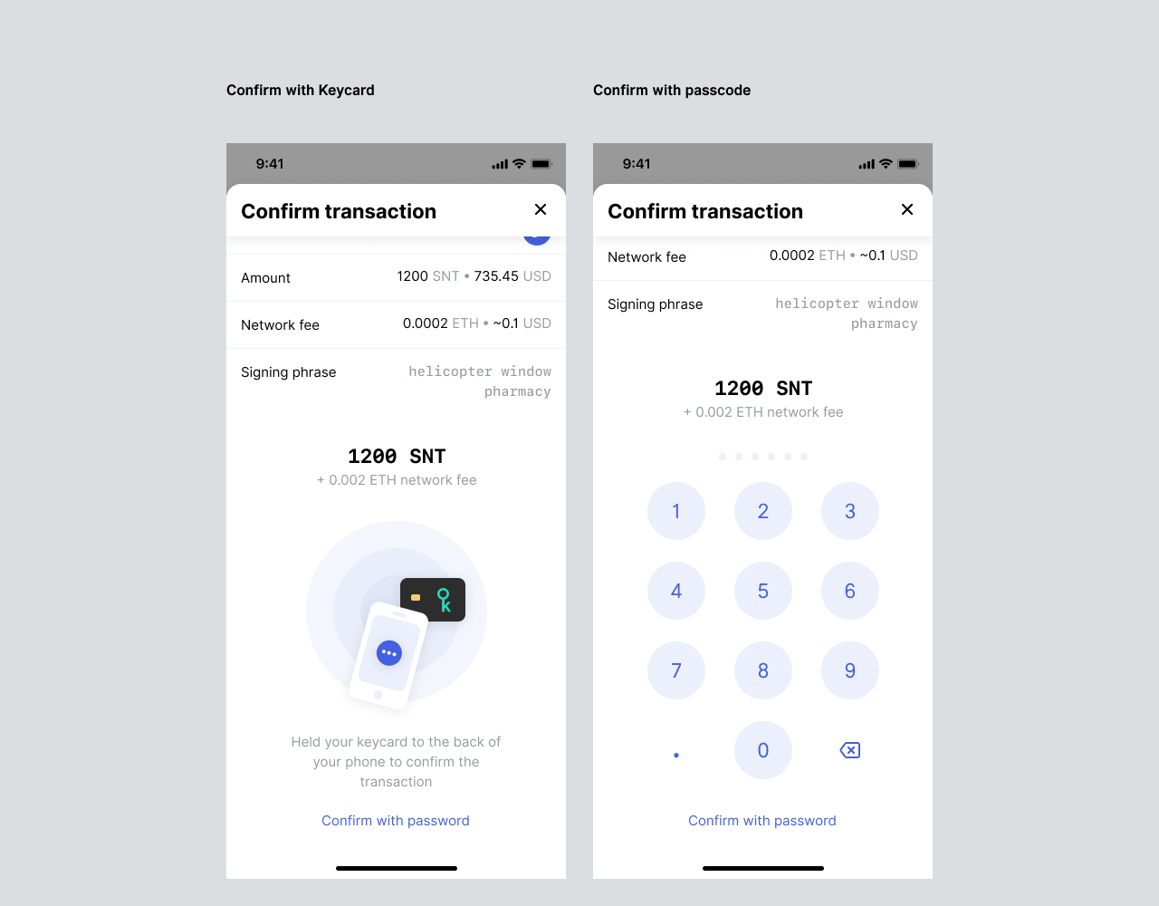
Transaction overview screen now has all the information nicely organized. The signing phrase is just another list item in the overview to avoid confusion (users treated the signing phrase as CAPTCHA text and entered it in the password field)

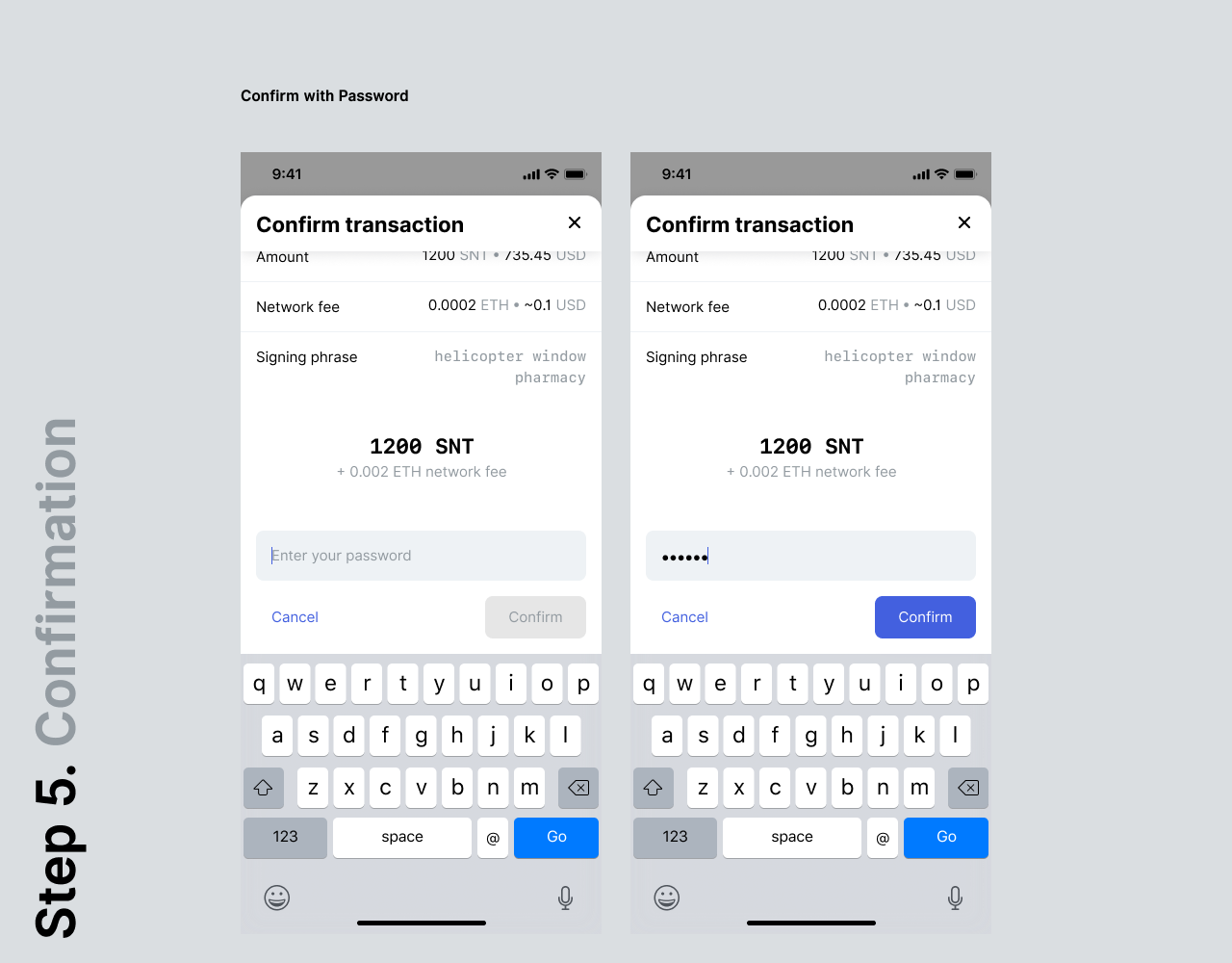
The overview screen provides confirmation options depending on the user’s setup: Keycard, Passcode or Password. Password is always the “backup” option.

The overview screen could be used separately, when the transaction details are pre-defined.

The confirmation happens in the same scrollable overview popup. There could be 3 confirmation options.


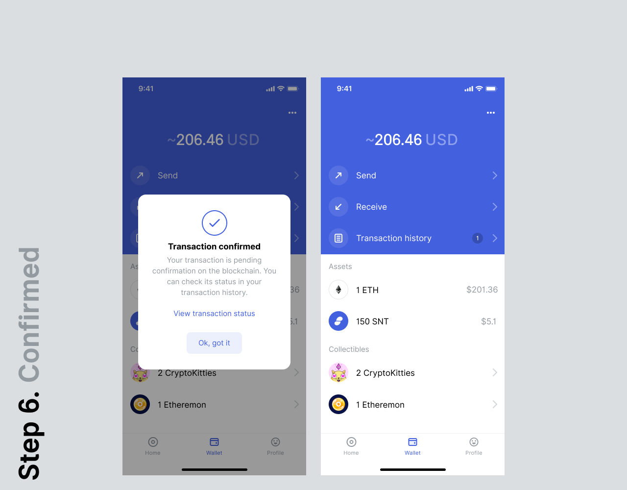
The success screen is now a popup which is a much lighter solution which respects the context.

Here’s a simple prototype with an SNT transaction.

Is is not a final solution but in my opinion it’s a step forward. Would be happy to hear your feedback or even maybe organize a call and discuss this flow and the possible improvements of it.

cc @guylouis @hester @maciej @goranjovic

3 Likes

Heya. The flow looks solid and totally agree on the rationale behind it, Sending transaction should be a self-contained widget, similar to say Apple Pay.

Some UX things tho:
please don’t place the close button on the right side, we never do that and no matter how convenient it might be for your layout, it’s a start of a bad practice.
• With Select coin, I’d love if you could make the list more scannable by including a separate ‘Used most often’ or ‘Recently used’ section at the beginning of the list, 2-3 items tops.
• Choose Recipient. I don’t like the Address-Contacts tab with the buttons just underneath, it looks too busy and the controls look grouped yet they don’t have the same function. I’d put the buttons below the address.
• The custom keypad, it’s not really more flexible than the native one and it introduced a ton of headache with smaller viewport layouts, in hindsight I’d probably go with a native keypad.
• The question of if we’re introducing a more primary button component with the accent blue background. I’m not saying no, in fact I started to use the same in dapps. Also if we’re introducing ghost buttons with a pill shape? Why I’m asking, wallet didn’t play by the rules of our UIs before and I’d hate if we exchanged one coat of paint for another with the exact same problem.
• love the monospaced font, it’s not Inter tho is it? We could prepare a version of Inter (it’s Open Source, we can modify it) with monospaced numerals and slashed zero by default, it’s not hard and the glyphs are there.
• Is network fee tappable on the Specify Amount view?
• The confirm transaction dialogue and its steps is super nice, well done. Maybe tho, I’m not really sure if the user pic and token badge aligned to right of text label look ‘right’?

2 Likes

Thanks for such constructive feedback Maciej! Appreciate your time and effort to look through the flow closely! I will update the screens and address some of the issues you’ve mentioned and provide reasons why i disagree with some others :slight_smile:

Great job, dude! I want to discuss “confirm” word usage, usually it means that your tx was confirmed by the network, so it has a few confirmations from the network, so i think better to use send ,not confirm, and maybe transaction here is extra, we can just use send, because most users don’t know about transaction, they just want to send assets :slight_smile:

1 Like

UPD
Updated the prototype https://www.figma.com/proto/XUehMnhyD1FGcWzvGz6SXqvh/Mobile-wallet?node-id=915%3A3422&viewport=-517%2C261%2C0.455073&scaling=min-zoom
Added contact list, custom network fee, few other updates.

If anyone’s interested, here’s the project on Figma, feel free to leave comments here https://www.figma.com/file/XUehMnhyD1FGcWzvGz6SXqvh/Mobile-wallet?node-id=915%3A2205

Nice work Andrei. I like the modal/inline flow. Have left some comments in Figma

1 Like

Looks great, have you given much thought to how this would look with multiple accounts? Would be great if we understood what that would look like since I know Keycard is desperate for it, in the wallet and in this flow.

Just to confirm the passcode is the pin? Does it still make sense to have password? I thought we agreed that the pin moving forward would be the password?

Instead of two separate branches for keycard - The application should be aware if the user is using a keycard. So wouldn’t it be smoother to show keycard screen with confirm with passcode, and if no keycard setup just display passcode screen (which itself can have a use keycard button)?

Also we’ve been doing alot of redesigns and re-implementations of the application which takes several months every time, and we haven’t launched yet, I don’t want to stop this innovation, but i would ask we’re all mindful of this.

3 Likes

As per Status.app I would just like to state that I think it’s another unnecessary third party dependency to add USD value, unless read from an on chain source like uniswap. It’s better to approximate usd with respect to dai as read via uniswap than to depend on exchanges, cmc, or other sources.

Other than that this looks great and would have prevented the problem I had as described in the post linked above.

UPD 2
Thank you all so much for the comments!

Updated the prototype https://www.figma.com/proto/XUehMnhyD1FGcWzvGz6SXqvh/Mobile-wallet?node-id=1011%3A1300&viewport=417%2C-663%2C0.303033&scaling=min-zoom

Fixed and addressed most of the issues based on everyone’s feedback. Added basic multiple wallets support. Check it out!