We have been in touch with Peter from Curious Giraffe regarding some analytics dashboards to measure and report on the various SNT utility features and the data available from their use.
These are not only useful to report on the adoption of specific features, but also helpful to the Token Economy Swarm team in validating the token models produced by @barry.
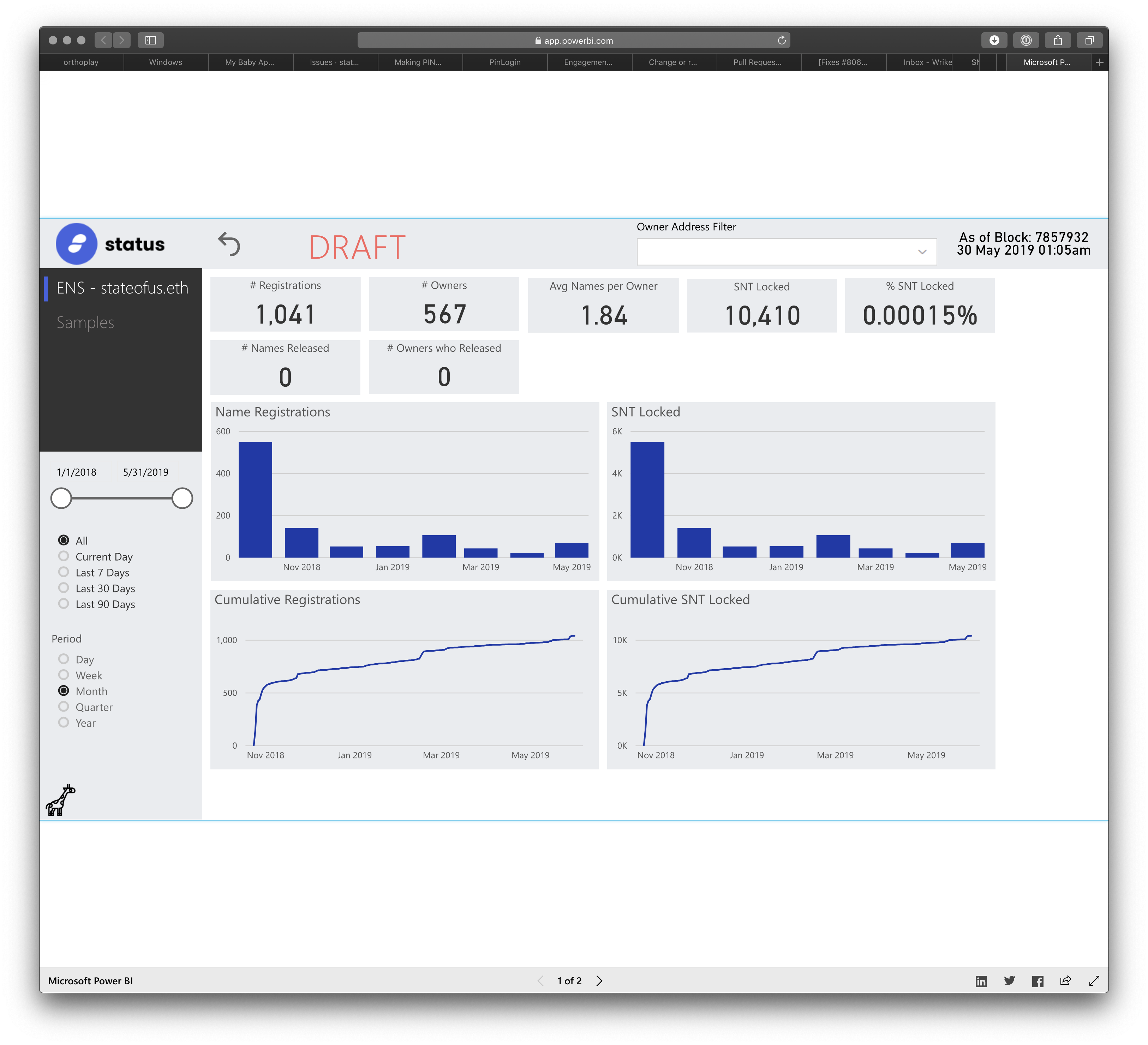
With that, please have a look at the First Draft of the ENS dashboard and provide feedback. For now, Peter was briefed to provide high level metrics for the token economy swarm including:
Data Points:
Total stateofus.eth addresses registered
Total stateofus.eth names released (not included yet)
Percentage of people who return the name (not included yet)
Avg number of stateofus.eth registrations per address
Total SNT locked in registry contract
Percentage of total SNT locked in Contract
View By:
Cumulative
Period
Day
Week
Month
Quarter
Year
Are there any other crucial data points you would like to see included?
Is there any design feedback on layout? Once we lock the content, we can play with design and layout.
Also, please note that we will look to produce similar dashboards for all of the SNT utility features. And then have one master dashboard to view things like:
Total SNT locked up
Total SNT Burned
Total circulating supply
Which feature is responsible for most transactions/events
My feedback:
Overview - this needs to indicate that this is for ENS stateofus.eth registrations only and a simple description as to what the feature is.
We will need to account for other feature dashboards and an overview dashboard. Perhaps this is some sort of top level navigation.
Cumulative Registrations and Cumulative SNT locked need to be clearly labeled as such. Currently those sections are not clear until you hover over the data
Im not sure how valuable the “registration transaction” info is below. It is nice to see exactly when a name was registered (date, time, hash) but not entirely useful. Maybe we just link to the contract on etherscan?
Peter from Curious Giraffe here. I stumbled across this discussion via Google Analytics on CuriousGiraffe.io.
Please do treat that initial sample very much as a first draft. To get it out as quickly as possible, the layout is copied from our other dashboards, but this is very much up to you.
@barry - At first glance, other than right clicking and selecting Show Data to see the data behind the chart, I can’t immediately see a way to export it when viewing embedded like this.
Please feel free to send over any feedback or requests you think of.
A few questions in anticipation of the next items on your list:
Do you have a list of other contracts that lock up SNT, other than stateofus ENS registration?
Does burned SNT go to a particular address, or are the tokens removed from supply?
@peter thanks for jumping in here. Let’s use this forum for feedback and ongoing discussion.
We are currently building the other SNT use cases that will lock up SNT. However, non of them are currently available in the beta version of Status as they are in active development. Some other future use cases are being built by third parties teams such as
Dapp Curation (SNT staked by DApp developers to list their dapps)
Teller Network (SNT staked to become a seller in the network)
Many of the other SNT use cases are more transactional and are not locked in a contract. You can see a WIP SNT use case landing page we are planning to release asap here for reference (please note we are performing final tests so mind any minor issues).
SNT burned (as far as I know) is taken out of total supply.
@andmironov@maciej@hester - do you have any feedback or suggestions for layout and design? Perhaps we adjust sizing and placement of certain data points to create a sense of hierarchy? To me, Total Registrations and Total SNT locked are key figures and we can create some information architecture/hierarchy to reflect that. We can also brand this a bit more. wdyt?
This is great! Both Dashboard and Network token page. Is the tooling the full package of Microsoft Power BI? If so I’ll check it out to see what formatting freedom this tool has. Also, is this the primary tool Peter uses or is there the option of accessing the data through other tools?
cool beans! my immediate feedback would be to include padding on all containers so content sits further from the edges of those grey boxes. And those grey boxes could use rounded corners. The logo is pixelated, we can either have it in SVG or decrease its size, ideally both Also the scaling behaviour is a bit weird, the ratio is locked down so unless you have the same ratio of your browser window there’s empty space above and below.
It’s cinematic sure, but it would be nicer if it responded to browser window ratio With regards to hierarchy, if you’d remove the grey backgrounds from everything else except Total Registrations and SNT it would be likely be enough and should be easy to do. As for branding, we can replace the Microsoft font, Segoe, with one of ours, introduce our colors, make it whiter and more airy.
@hester - Yes whatever Power BI has available is available. For now this is the primary tool we use. Anything is possible, but the cost/features/speed of development/data source options of Power BI makes it the most attractive for the time being. Tableau Public is an option too but there are a few more technical hurdles to iron out first. A full custom dashboard using D3 based charting libraries is also of course possible, but requires a significant larger amount of dev time. Raw data can also be made available via REST API.
@maciej - Padding - I don’t think this is actually editable, aside from hacking a larger shape behind a transparent chart, or the background can be removed entirely. It can be centred or right aligned instead of left. Rounded corners - possible - see sample chart. Logo - Agree - this was taken from the Status website (https://status.im/img/logo.svg) Is a higher res png or SVG available? Ratio is always locked. It can be anything, currently 16:9, but can be changed to 4:3 or anything, thats just how Power BI embedded works.
With analytics platforms (like Power BI, Tableau, Qlik etc) there is always going to be a tradeoff between time to market / ongoing dev overhead and a fully customisable UI. A complex fully functional dashboard with cross filters and drill downs etc can be built in a matter of hours (provided the data is readily available), but you may have to accept 85% of the perfect UI.
It sounds as though the UI is not as flexible as I had hoped. Is this due to limitations of Power BI or is it resource restrictions? If it is a matter of resources, I could potentially put out a brief/bounty to the community and ask them to design and develop the front end. Would that be possible?
Regarding the data presented - this looks really nice. What are next steps in development? Perhaps a call some time this week or next to discuss next steps on this dashboard? And what we can do for the other SNT Use Cases?
Nothing to do with resource restrictions, this is just the way it is with analytics platforms. I dont think any of the UI limitations are too material though. An analytics dashboard is designed for consuming data, and is very good at that. I think the best way forward is probably for you to mock up a design. We will then update the dashboard to match your design and layout, or at least as close to it as possible. That will be a good point to assess the UI limitations, if any still exist.
Keep in mind that this is an iframe that can be embedded in your website, in an area of any size. So it can be surrounded by your familiar header and as much of your site down the sides or bottom as you wish. The Status logo and header can be removed from the dashboard, with just a white background containing the chart objects, which seamlessly fits into an area of your site.
Thanks for the catch up today @peter. To recap our call and next steps:
We will mock up some simple designs and run them by you to determine what is an what is not possible.
We will need a landing page as a “cumulative view” of high level data as it relates to SNT. Ive dropped some basics into this wireframe (please note this is WIP and I am not a designer ) but it doesnt really give a good view of what features contribute most to each data point. At a high level I figure we want to display Can you think of anything else that would be a nice cumulative view?)
TOTAL SNT LOCKED
TOTAL SNT BURNED
TOTAL CIRCULATING SUPPLY
SOME SORT OF TOTAL TRANSACTION DATA WITHIN A GIVEN TIME PERIOD
We will aim to launch this dashboard initiative as one of the first projects under Liquid Funding and as part of the Status Network. Exact timing and comms plan to follow.
@timhartmann - thanks for the response and looking forward to potentially working on this together. As stated via email and above, we are creating some dashboards for the SNT Use Cases. As there are many use cases - each of which follows a different token model, we will need individual dashboards for each feature. We will also require a “landing page” with a cumulative view of SNT transaction data. Check out a design brief here for a chat next week as well as the figma file above.
don’t know if Google Data Studio is another option here. Might not be that powerful regarding functionality compared to Power BI (yet) but there is a lot of freedom regarding design. It’s development is very fast, there are several connectors available. The dashboards are easy sharable and also embeddable.
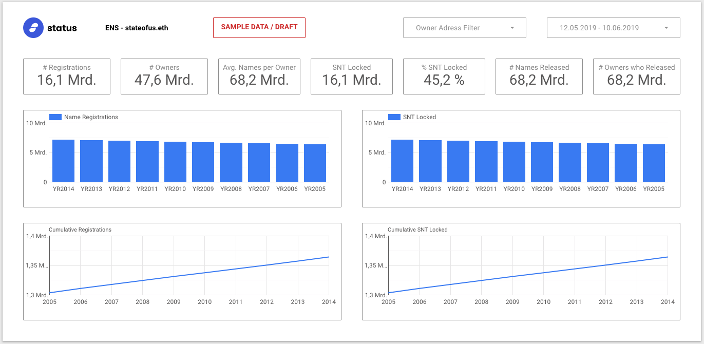
Just did this quick draft with a sample data set. Let me know if you have any questions or would like to access that draft.
This looks really nice! Im not too sure of the functionality differences between Power BI and Google Data Studio but after a quick search, it seems as though Data Studio is still in beta and rather limited.
@hans f you can figure out how to pull the data needed via this tool, it will certainly be worth exploring.
The data can be pulled directly into Data Studio if it’s stored in a common database, such as MySQL, for instance.
If someone could provide such a database (or Google Spreadsheet / CSV for testing purposes) I could connect it to the dashboard shown right away. (Proper formatting provided.)
Yes Google Data Studio is coming on nicely as a BI tool. We have primarily stuck with Power BI based on being familiar with it, and it doing what we need it to do, but any dashboard tool is on the cards.
There should be a motive for considering changing platforms though. Google Data Studio is quite light in functionality compared to the likes of Power BI and Tableau for example. If it is attractive based on the look of the dashboard, we can use that as a template and quite likely get very close to it. Remember the Power BI dashboard in its current for has not had any proper design thought put into it yet.
Google Data Studio will have the same drawback of not being able to use a custom font, and cant connect directly to a REST API like Power BI can. This is how we currently connect to our back end. From what I recall, I think the Google solution requires a data connector between the api and the dashboard (likewise with Tableau). This was one of the reasons we opted for Power BI initially, as it can source JSON directly from an API end point. We could look at querying the database directly, but initially the decision was made to access everything via our API. I will hopefully be able to share the relevant end points with you soon’ish, so you can access the raw source data.
Having said all that, it is certainly an option on the table, and if there is enough motivation to use it, by all means we can spend the time.
Going back slightly to the data side of things, is someone able to provide an example of a transaction whereby SNT was burned? Has this happened ever?
And regarding transaction history (as per your overview sample @jonathan) would number of transfers of SNT tokens be the best metric for this? Or volume of SNT moved? (or both?)
There has not been an example of SNT burned yet. This will come in future SNT use cases such as Teller Network in which SNT may be burned in instances when there is no arbitration needed (exact details tbd). But once again, there are no current instances are active use cases in which SNT is burned.
Regarding transaction history - that is a good question. I want to signal the adoption of SNT use cases. So I think best to show Number of Transfers of SNT tokens as opposed to volume of SNT moved. (I took this from etherscan btw)
Making progress on the ENS dashboard with @peter and @timhartmann. Thanks guys!
We now have a general layout design, style and navigation structure for the work.
Please review the latest “SNT Dashboard Homepage” here. This will include a cumulative overview of SNT data. Then the navigation (not seen in the draft) will provide links to individual SNT use case dashboards. With that, the cumulative view currently feels a bit out of context.
Current Data:
Total SNT Locked
Total SNT Burned
Total Circulating Supply
Transaction History (in total transfers)
I feel like it needs to tell a bit more for context. Perhaps:
Total Supply upon Token Sale (total SNT distributed)
Total SNT Burned
Available Supply (= Distributed – Burned)
Total SNT Locked
Circulating Supply (= Available Supply – SNT locked) ???
Transaction History (14 days) - Number of Transfers
Transaction History (14 days) - Total SNT volume
@barry@petty is this accurate? Im slightly confused about the difference between burning SNT and locking it as it related to circulating supply. Is locked SNT considered out of circulating supply the same way burned SNT is? Is there anything else we would want here?
The ENS Dashboard is coming along and nearly complete. Just need to tweak some minor style issues and then implement the navigation. See slide 4 of the doc
Similar, in a given period both are counted as positive value accrual but locked SNT can be released and when it is gets counted as negative value accrual. The net value accrual in a give period is amount locked or burned - amount released or minted.