This post is an attempt to revisit and reimagine what the Status app could or should be. For the record, this concept ‘is’ and ‘has been’ one of the many ideas of @jarradhope which I spent time to visualized. I was also inspired in part by past iterations from @maciej
*Please note that I have no intention of discrediting what has been designed to date by the Product Design Team. This is an exploration and should be treated as such. The beauty of working at Status is being able to constantly challenge (update) a system makes for a better system…This has always been the way here, so don’t get comfortable ![]()
By definition a super-app or superapp is a mobile application that provides multiple services including payment and financial transaction processing, effectively becoming an all-encompassing self-contained commerce and communication online platform that embraces many aspects of personal and commercial life.
Some common examples of super-apps are the Apple Store, WeChat, and Alipay. We believe Status has always been a super-app but never correctly executed and fell victim over time to becoming fashionable and chasing standalone applications such as messengers, group chats and wallets. This has been a result in the past of product design and marketing teams needing to make a unique claim quickly. Rightfully so, as marketing teams talk about features and Product teams design them.
I have spent countless hours with @jarradhope and @carl discussing what could be. I feel I can say these things confidently as I have been with Status since 2017 watching the app design process slowly paint itself in a corner becoming more and more irrelevant.
When we step back and look at Status as a whole and analyze our original intention, ideology and future intentions it could be sensible to offer a product (or platform) that aligns with our decentralized stack and what a user (or community) might need in a ‘not so distant’ stateless network. This is why I feel it’s important to address this now. Products and features are not as important as platforms ENABLING communities and networks. I would suggest all aspects of design in our space to think first about modularity, portability and quick scaling solutions.
We believe a super app can be all these services in one application or platform. It would just be an exercise in time and functional design without any present constraints. What ever the ‘user’ decides is relevant (or not relevant) to them by choice in the UX/UI. Meaning as a user; I should be able to decide what I want, when I want it and how it looks.
This is essentially how an OS or OS Launchers function, the user can customize their own experience. This is how we would like to approach building this super app. You can think of this like calling in modules or ‘widgets’. As an experienced user or developer I may only want a search query. As a n00b I may opt for the pre-configured widget theme. Whatever your level of experience, it would be your choice.
With three example user types in mind, We explore the following UI/UX options:
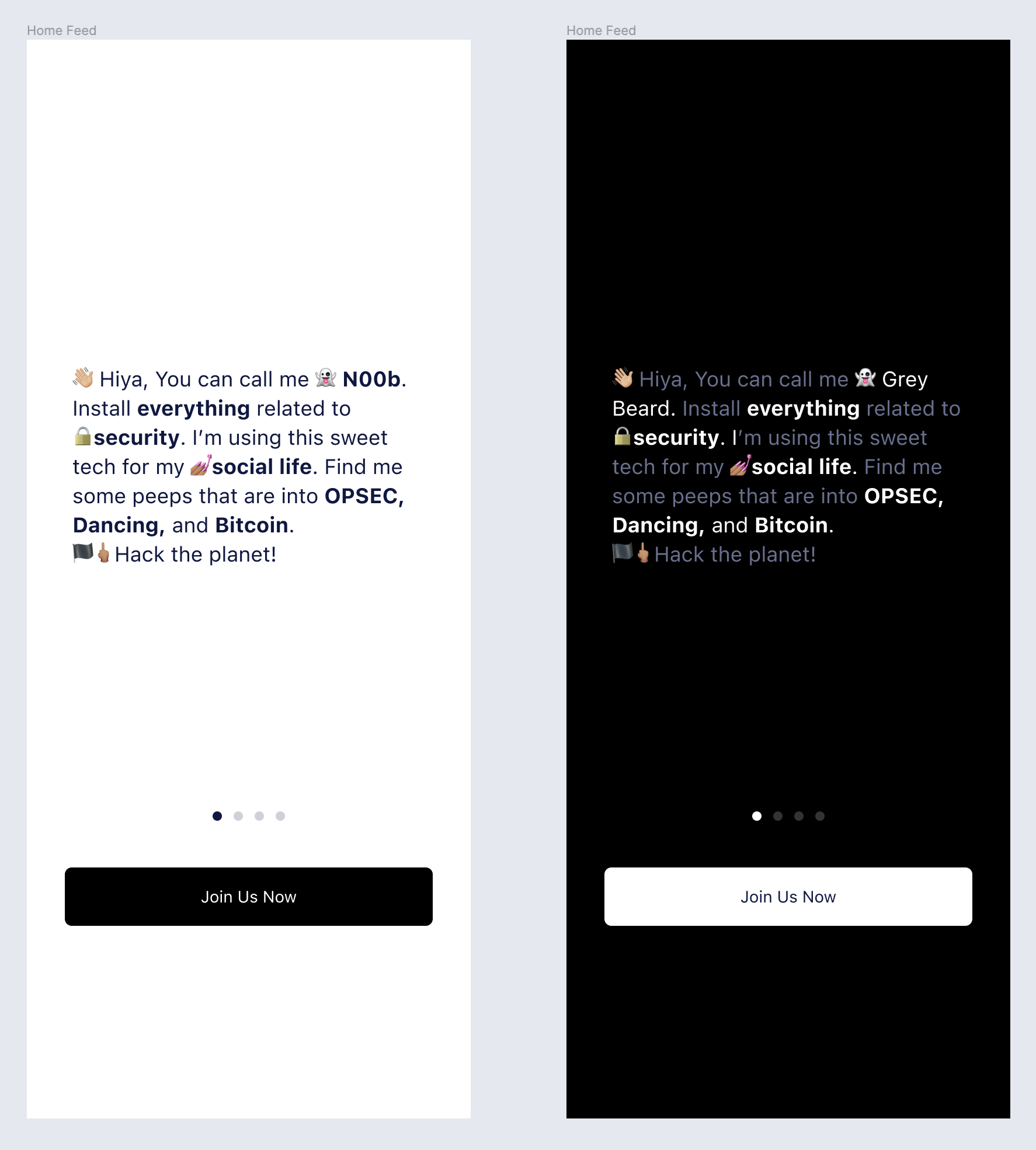
Grey Beard Mode - A minimal 'calling' function in the 'search' query
Regular Mode - A 'feed' mode based on a users selected modules
N00b Mode - A 'widget' mode based on a users selected modules, this could be pre-installed themes
In order to achieve this we would investigate and design for the following concepts:
-
A modular grid system that allows for customization
-
Minimized to expanded designs of all ‘widget’ modules
-
A UI that allows the user to chose for viewing as many or as few options as they wish
-
A way to edit, delete or modify modules
-
A dynamic feed mode which is constantly updated
-
A static ‘widget’ mode which a user can pin an app
-
A very strong ‘search’ query function
-
A ‘one-screen’ sign in / on-boarding
For this exercise I have adapted a generic version of the Evergreen UI component kit, guidelines and symbols. You can investigate the full Figma file here.
Modular Grid System
The grid system is modular which allows for a number of user customization options.
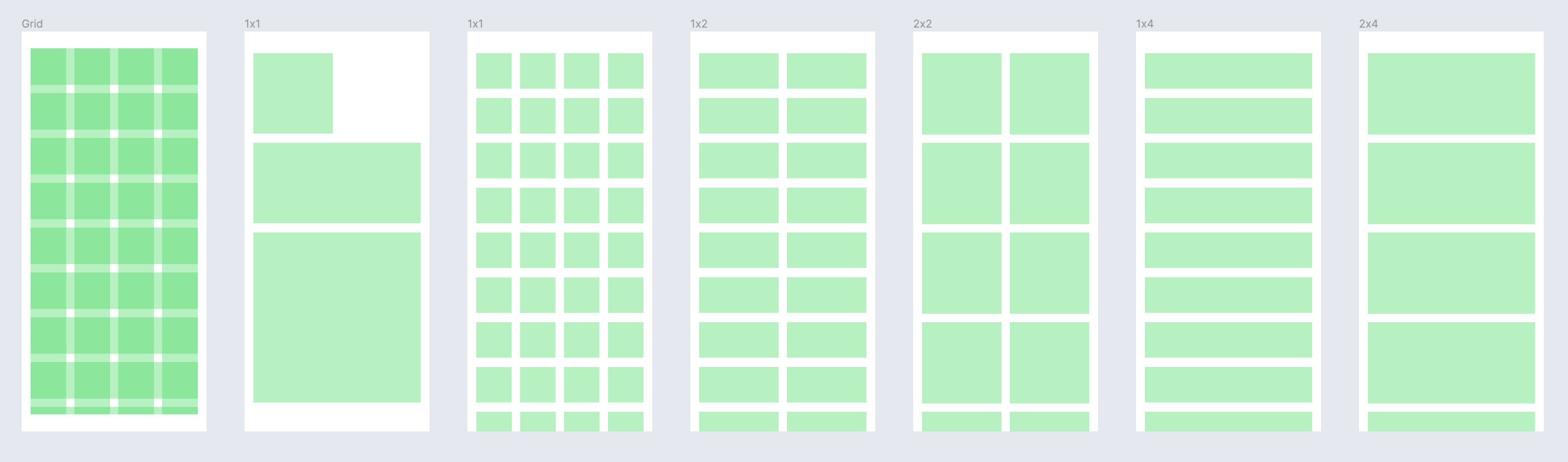
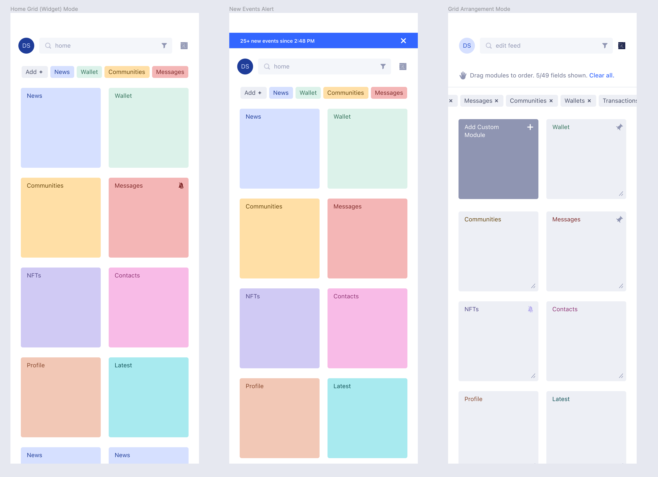
Fixed (widget) Mode
Here is an example of the fixed widget modules similar to any mobile OS. A user profile, search query with filter and customization tab. Below this you also have a tabs view for all modules and additionally the visualization of the fixed widgets below.
*Please note I have only used colour here to differentiate modules.
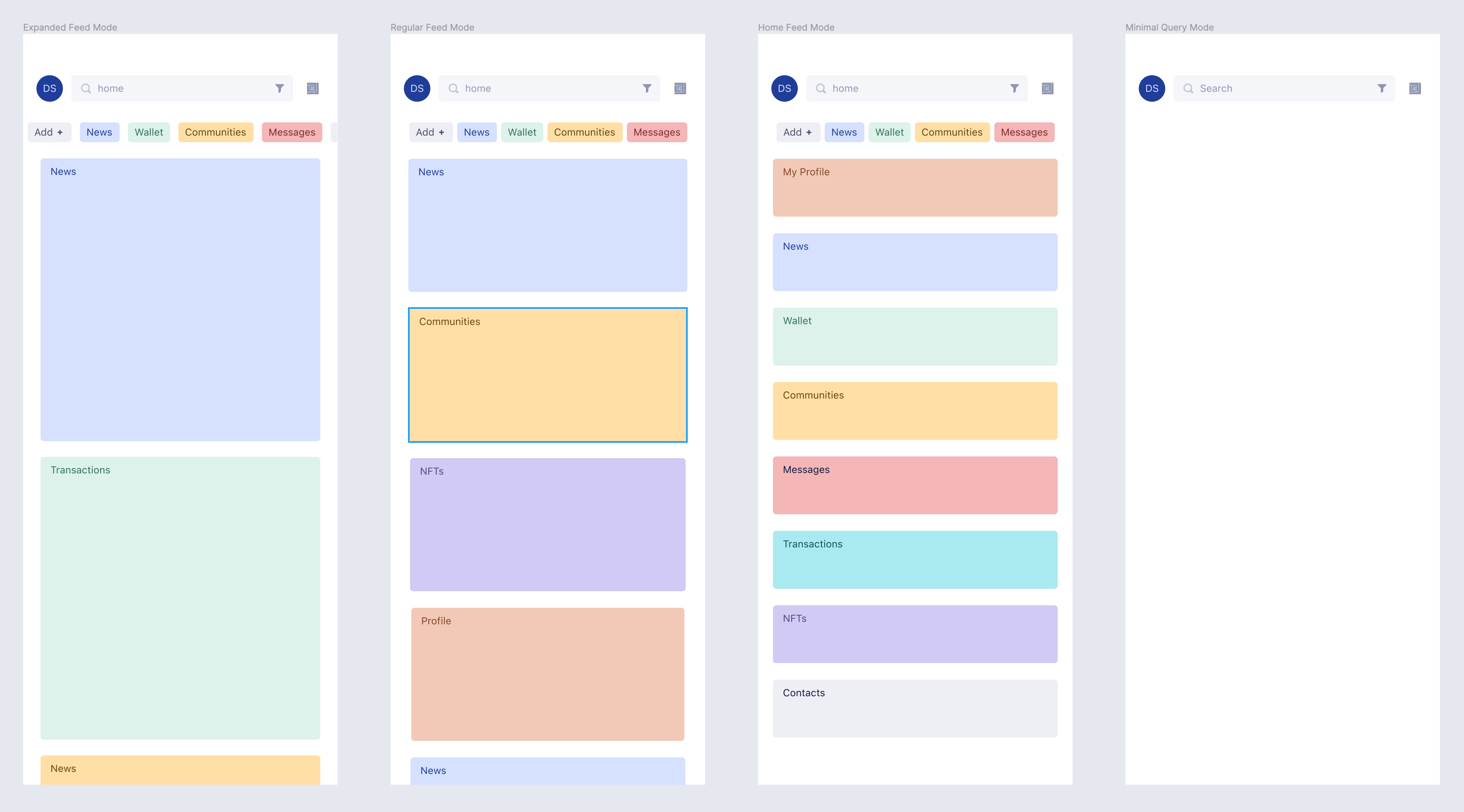
Dynamic Feed Mode
The dynamic feed mode is functioning like Twitter updating the newest content into your feed. It could also be an option to ‘pin’ certain modules. Depending on your view type the modules could be maximized or minimized. Lastly, You could by default use only the ‘search’ query which is actually doing all of the lifting for this type of application.
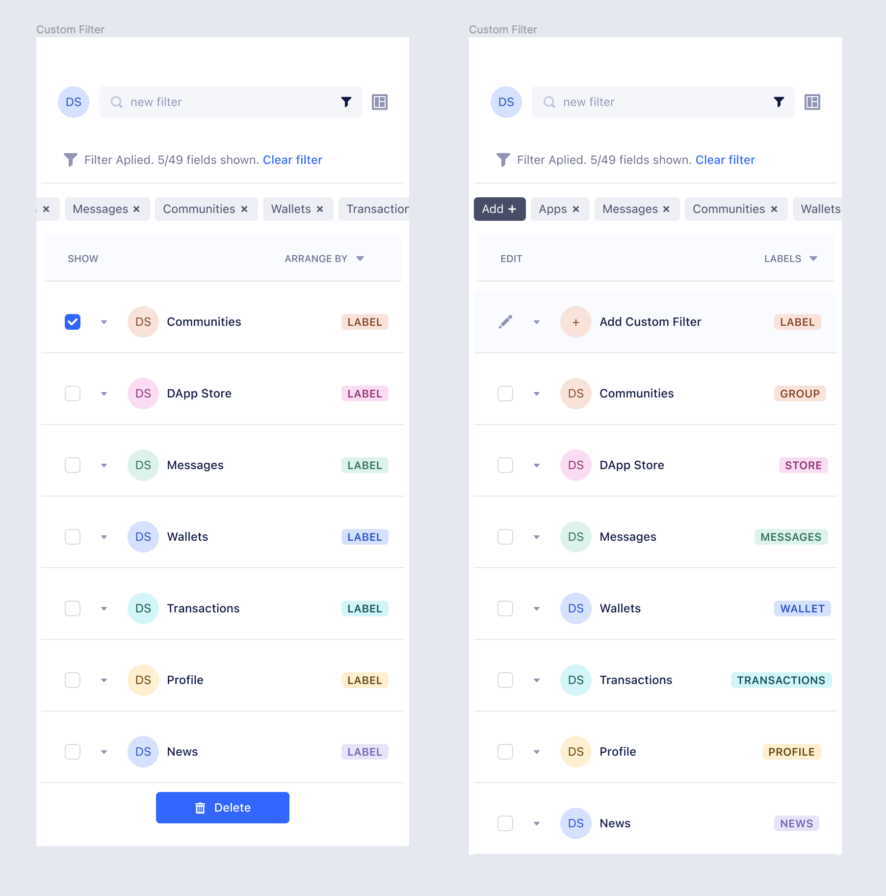
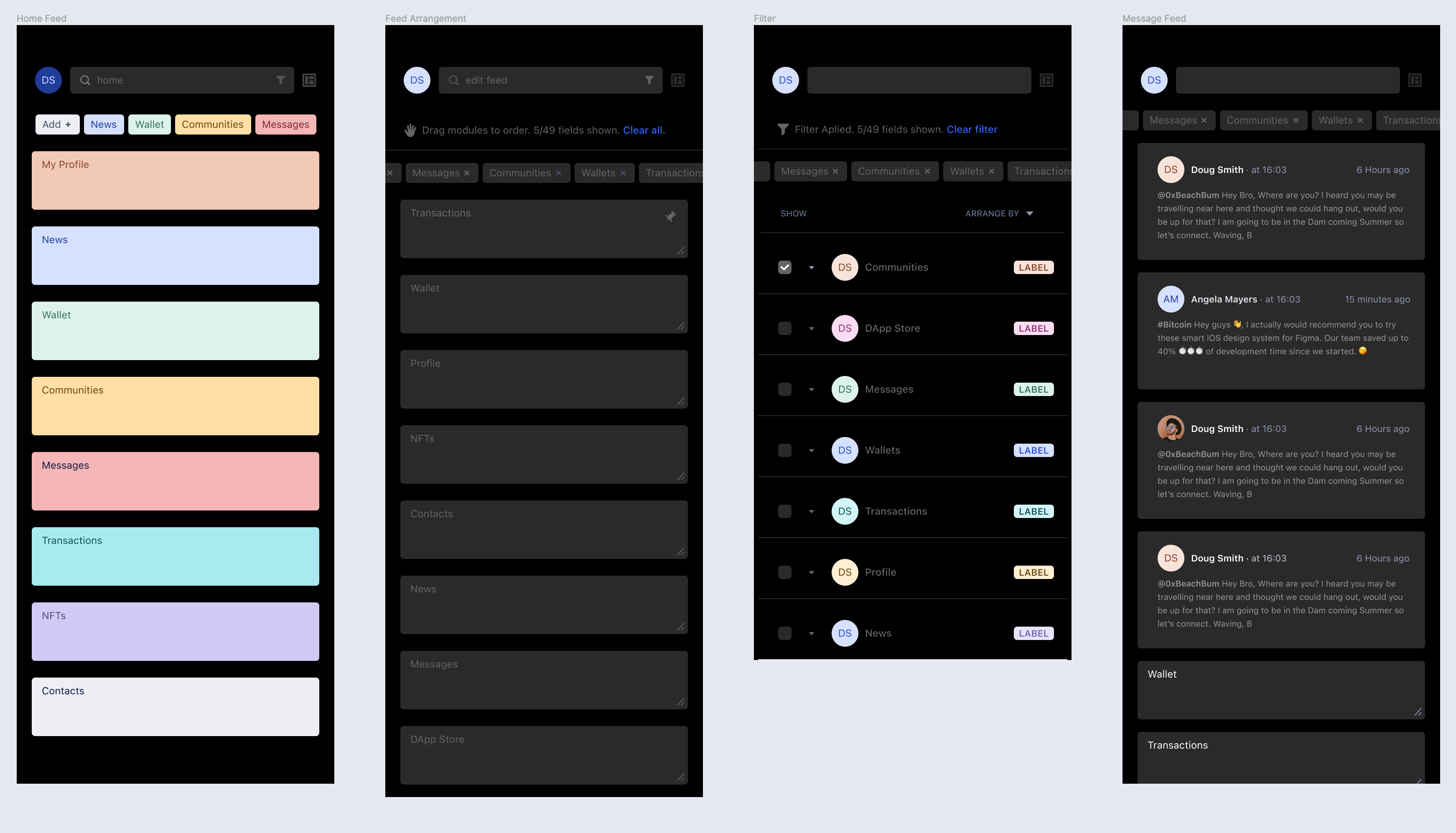
Arrangement and Customization Filters
Below is an example of how a user could arrange and add modules to their feed. Create labels or add new modules. These then also appear as a ‘tab’
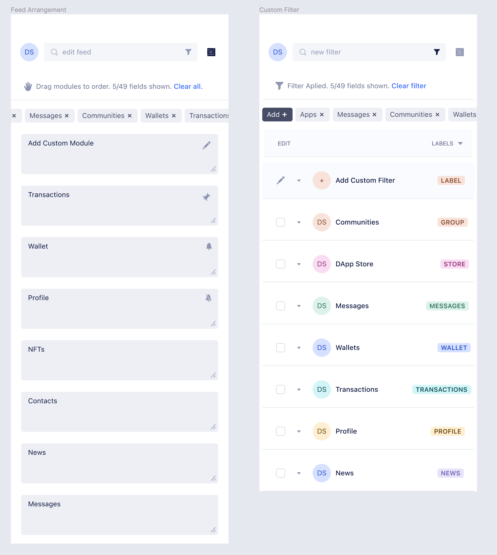
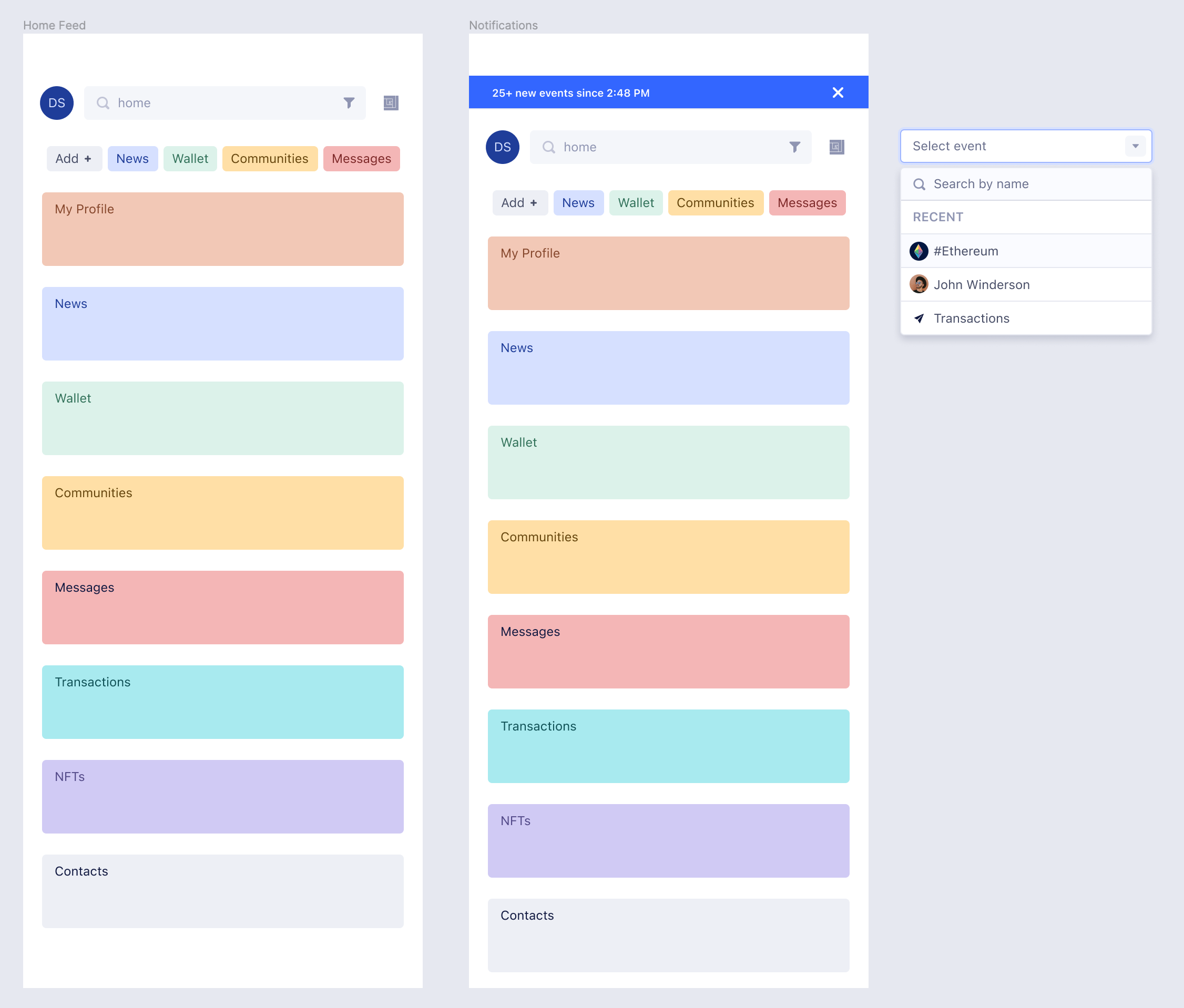
Notifications and Smart Search
The notifications could be a simple banner alert at the top of the application window.
Smart search reveals ‘recent’ queries and essentially should be able to search ‘everywhere.’
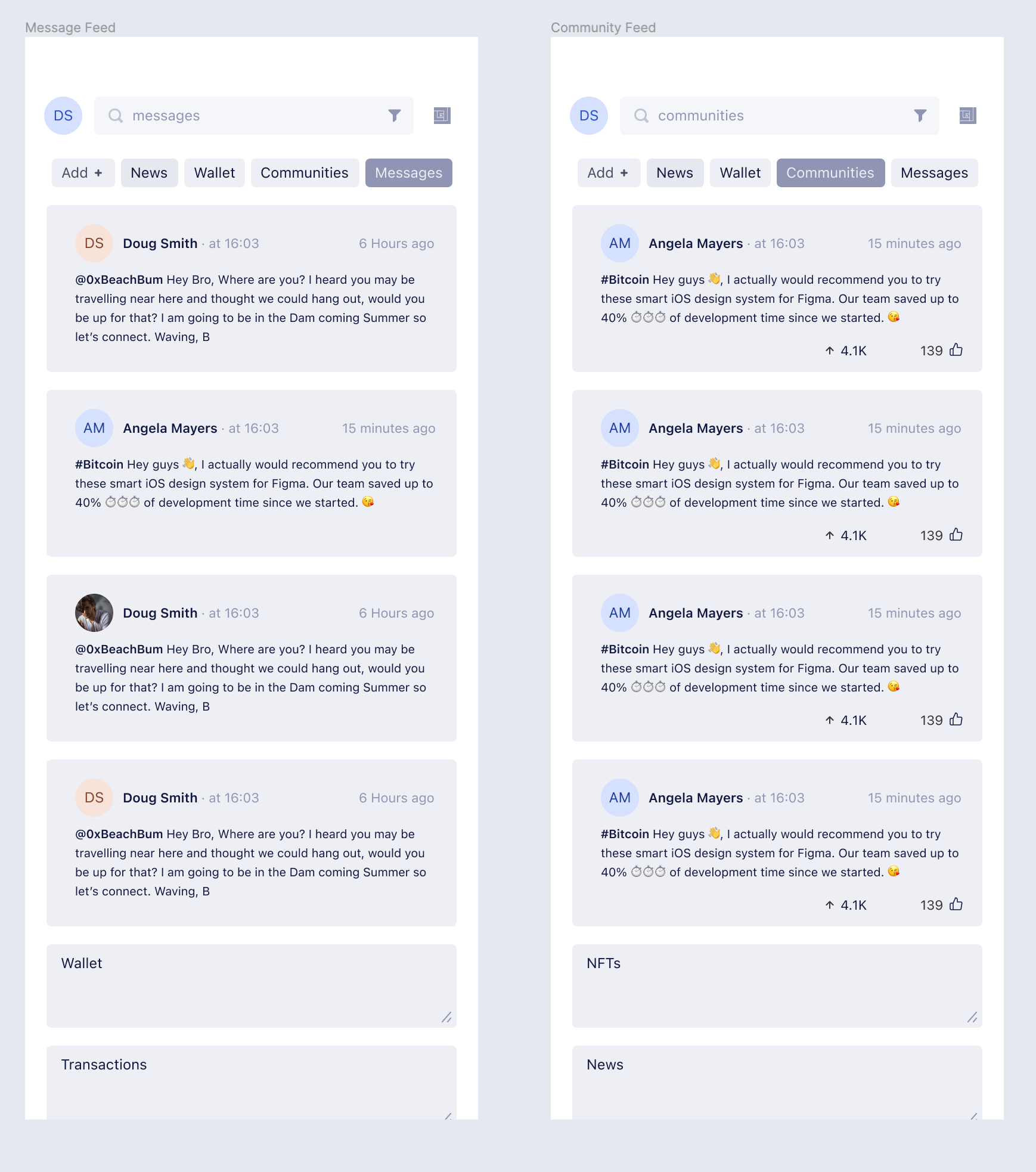
Messages and Communities Feed
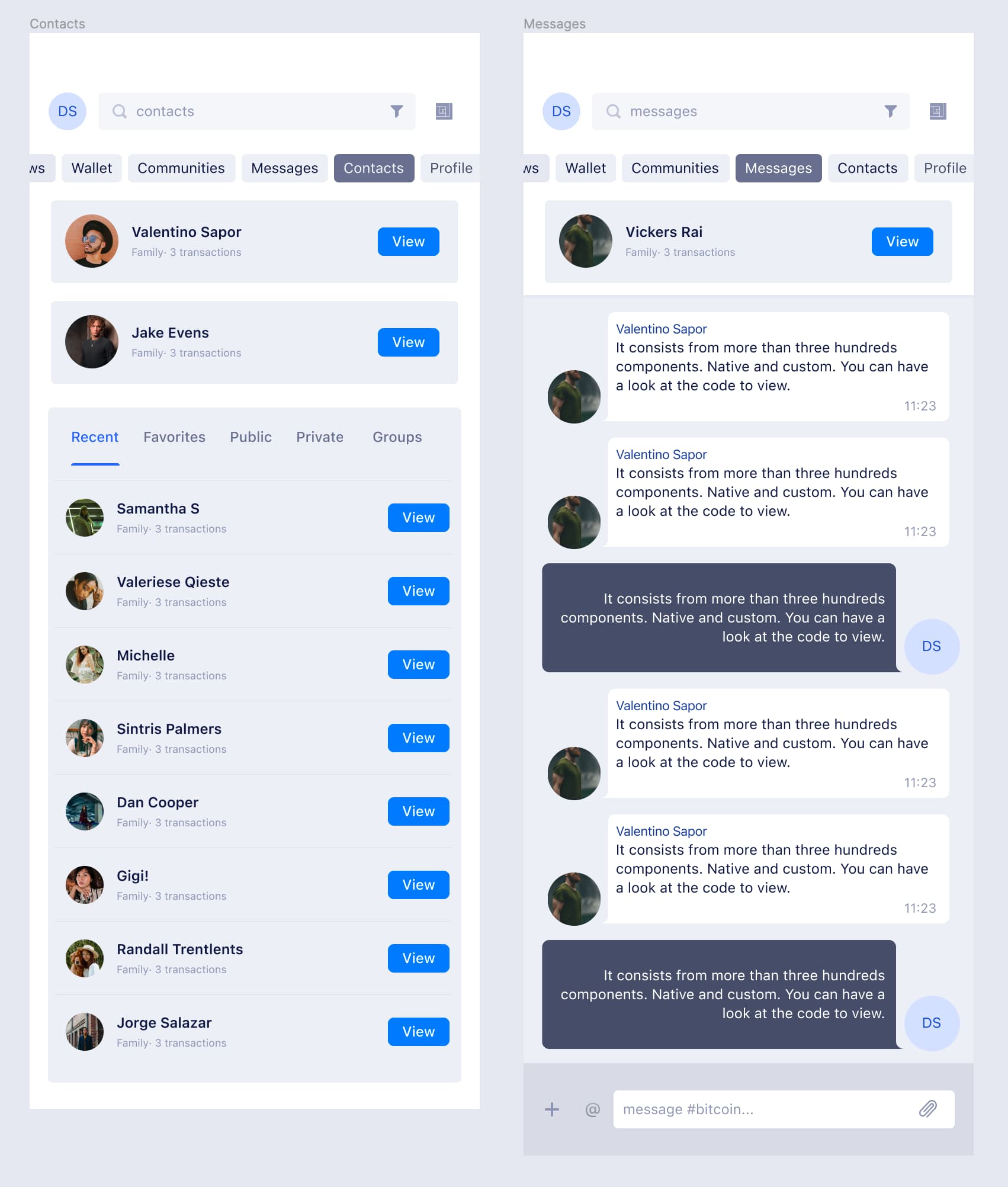
The messages can be accessed via the ‘messages’ tab or by querying for ‘messages’. The same functions for communities or any other module.
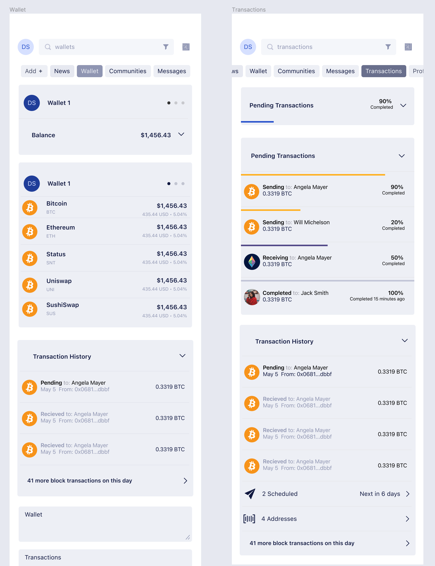
Wallet and Transaction History
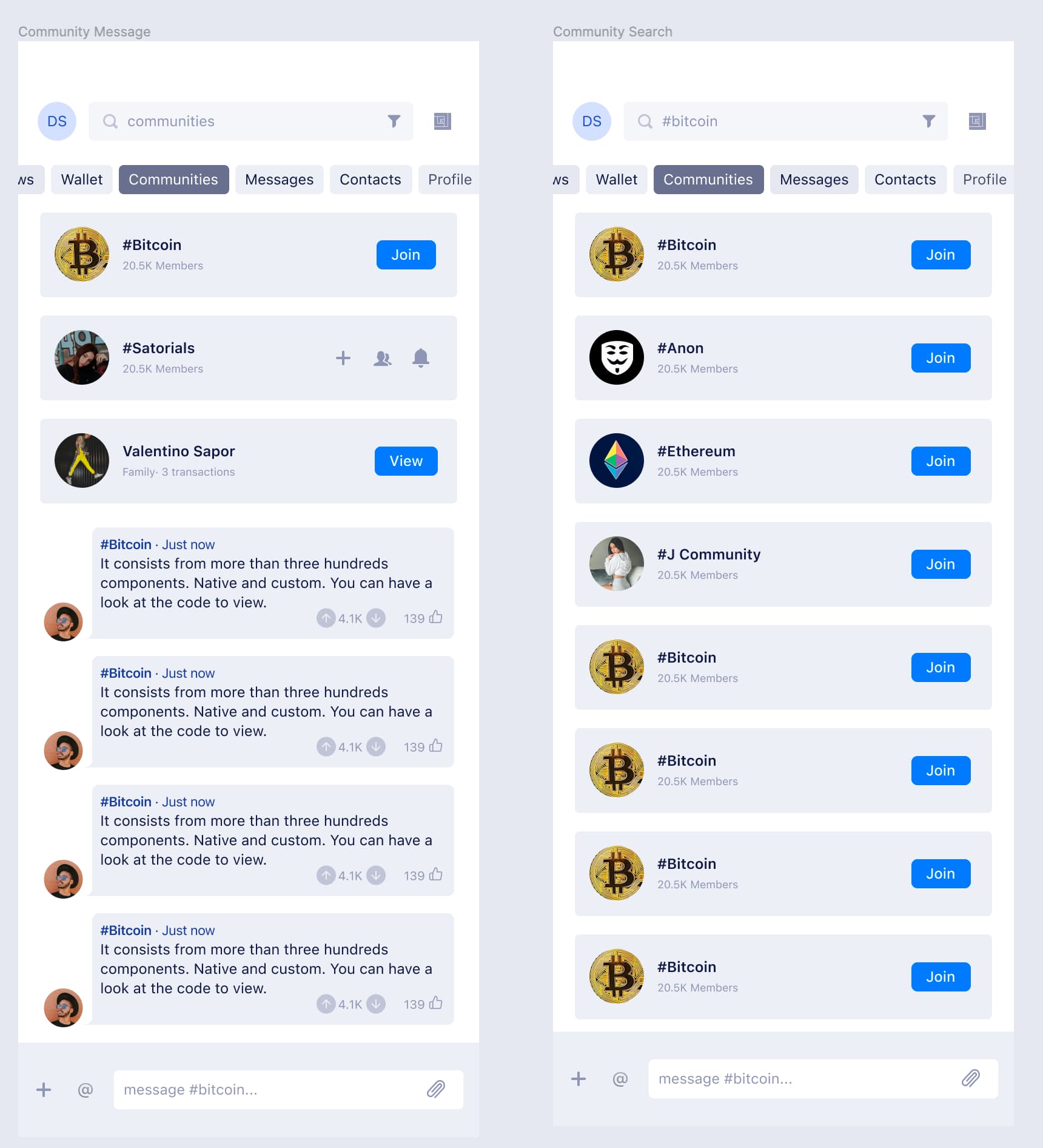
Community Messages & Community Search
Contacts and Messaging
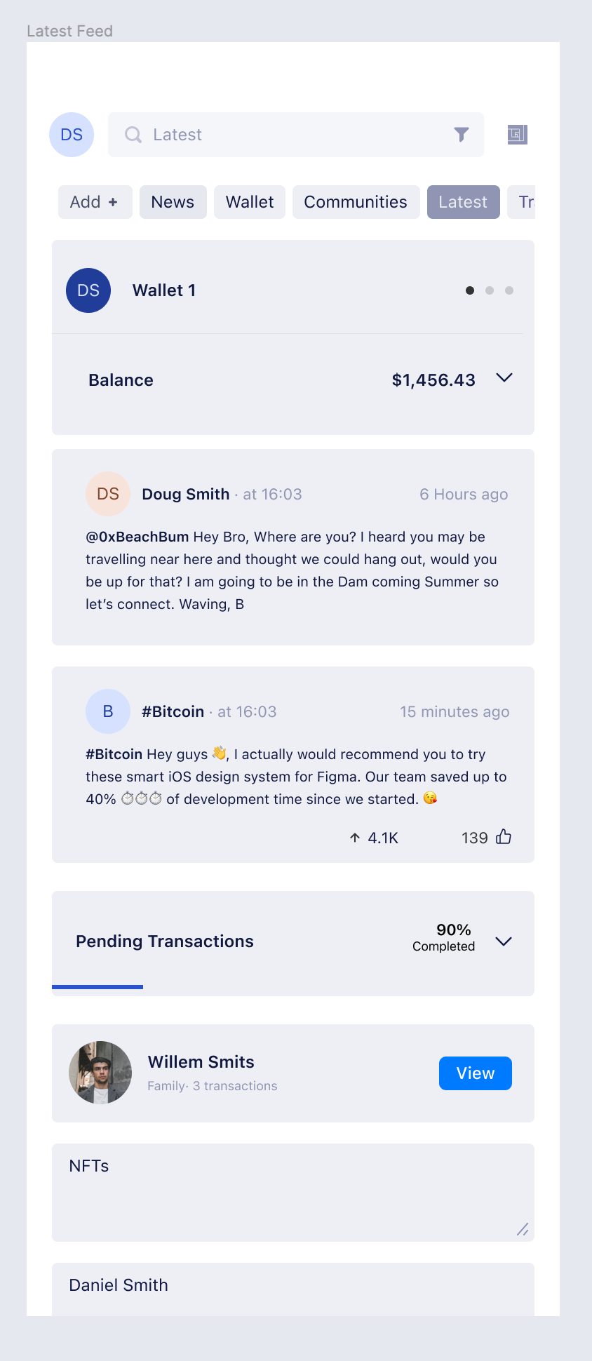
Latest Feed Example
Dark Mode
Fast Login
I also really like the idea of being able to sign in super fast by selecting a few key profile filters which could determine the level of the user, pre-installed modules or themes.
Conclusion
I realize there is many more levels of details and clarification needed to make this a functioning design system. I also understand that the designers at Status do not always have the luxury of time to explore these ideas and would very much like to if given the chance. So I hope I have added some new perspectives or ideas in your efforts moving forwards. Thanks for looking and thanks @jarradhope for spending so much time articulating the future.