I just registered here in discuss.
2 Likes
@jonathan I’m speechless, I have nothing meaningful to contribute, the site is everything we need exactly as we need it. Seriously, great job to everyone involved.
For contributing, I imagine that the progression for alot of developers new to clojure will probably want to work on extensions then to status-react, but that assumes we get beef up our extension support.
I imagine in the future we’ll want to make another, seperate web property after this which is more about the overall Status Network, which will show how Keycard, Status Point of Sales, Payment Network, App, token economy & community projects all work together.
3 Likes
@jonathan I love the Information Architecture. It is very sound and sensible. I can see how Contribution portal will be a big step up from what exists right now.
Having said that, it will depend more on the quality of content as well, and we can do well on it as core-devs and contributors come together.
I am barely starting to jump into contributing seriously, and from that perspective, I would love to see more effort put on having more docs like these:
Question: DApp developers come under Tool/Ecosystem Developers? or 4th category of audiences?
1 Like
@jarradhope @yalu thanks so much for the feedback guys.
I completely agree that the success of this portal is contingent on the content that support it. I feel once we have the base in place and the resources/guidance needed for early contribution, we can actually lean on the community to build out the content itself. A really great example of community tutorials is from Digital Ocean
In terms of contributor progress - I agree with you as well. People will have different paths and and different goals. So the aim is to get this first iteration up asap (with as much easily available info/resources) and then monitor and collect feedback. We can then let this evolve as the community sees fit.
@yalu - my thinking is that DApp developers will come under Tool/Ecosystem devs. We may want to break this out later on and also play with the semantics so it is a bit more all encompassing.
2 Likes
-Hutch @yalu @jonathan great to be here and be able to contribute.
my cent:
contributor documentation and extension developers sections have different audience and also different edn\clojure\reagent knowledge level.
So for the extension developers section, seeing it as an entry-point for novice developers who don’t know edn\clojure at all, info\docs should follow a “learn by examples” path. Starting from simple examples to more complex ones, novice developer should be able via copy\paste to create something that works. (i see it integrated with the revisioned extension development UX which we are going to start discussing). The API reference must be there but should not be the first thing the user see.
2 Likes
@jonathan This looks really awesome. Couple of notes:
-
Did we go for “Contribute” versus “Get Involved” as the section heading, or is that still TBD? I don’t have strong views either way, but would be interesting to see how the 2 perform.
-
On the main Contribute page, could we get a “We’re hiring” box or link that points to our open positions/jobs section (I have a to-do note to revise the content)? Maybe positioned below the “top contributors” section? I think anyone looking for a job would naturally look for it here (i.e. in Contribute/Get Involved and/or “About Us”. Given low volume of anticipated hiring it doesn’t need to be too prominent, and should be subjugated to non-salaried contribution.
-
On the “development” sub page, I would even separate the “Install Status and get set up” and “Open Issues” sections - perhaps into different sections/boxes to really make the “Open Issues” stand out.
-
re: Get In Touch: I feel strongly we need to provide an alternative to the 3 listed Status channels. I get we want potential contributors to download the app and dogfood but I also think it would welcoming (and remove barriers to entry) to at least provide another option to contact us - whether that’s traditional email ([email protected]) or something else.
The wireframes look good and well organized!
Let me share some more opinions with you.
Color:
-
In my opinion, the pure black color on the website looks a little strong. What do you think of using less stronger colors? It would look less forceful if we tone down the black color or use blue color series.
-
I think some components have the same or similar colors side by side, which makes images or text somewhat ambiguous to look. I put three examples.
1: the smartphones and black background have similar black colors. I guess a blue background would make the smartphones more conspicuous.
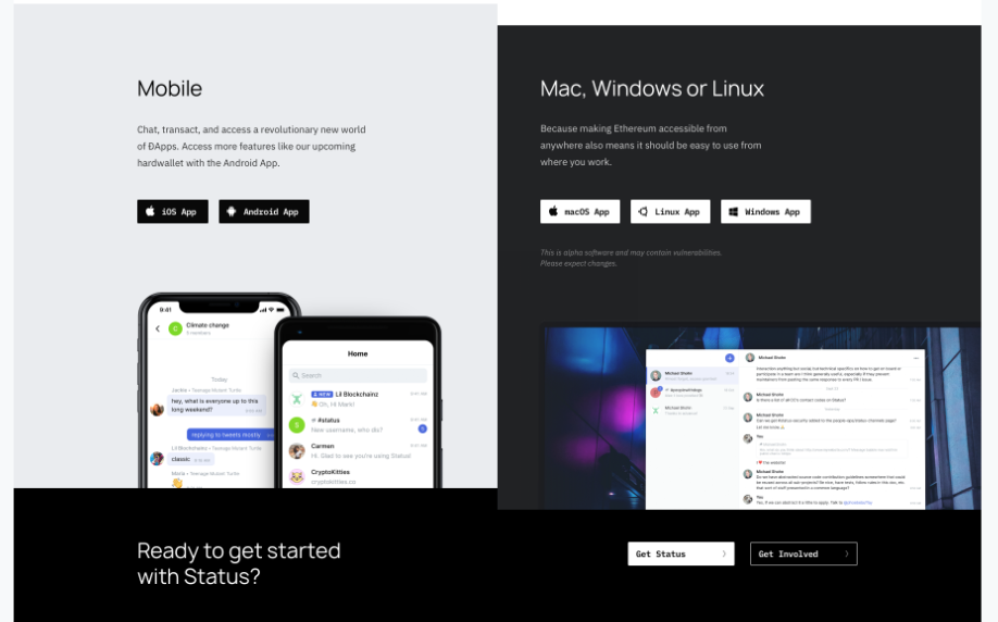
2: The dark grey box(Mac, Windows or Linux) and the footer(Ready to get started with Status?) have similar colors so it looks a little unstable personally.
3: Similar case, grey and black are located side by side.
Content:
- Dynamic content
I really love how the information is structured. But I found that everything is text or images. What do you think of utilizing our video assets like the tutorial videos or so? People tend to be more interested in something that moves. To give newcomers stronger first impressions, I think we need to add more video content on the website. Some proposed examples are
-
What is ENS? Simplify your Ethereum hash code!
[Video] -
Do you want to make use of a third-party program? Test out the extensions!
[Video] -
Status beta video or a feature video?
The video content will be effective on the features page in particular.
-
Media assets
From my experience, It is common to check out some media assets(articles, third-party content, etc) on a website to get more objective, promotional information. This idea needs someone to manage(select and upload) the media assets though. -
Less text on the homepage
Too much information on the first page could make tech-newbie visitors confused. If the website is planning to focus more on the general public, a simpler first impression would make more sense for them.
Considering these wireframes are the drafts, it is really awesome! Let me take a look at the documentation side from now on.
Thanks for the feedback guys. Some responses here:
- we have opted for “Get Involved” as it seems like a more active way to support rather than contribute. My concern at the moment, is that it is fairly similar to “Get Status” at first glance. This is something I would ideally like to test but will not be able to without any sort of GA. Perhaps down the line we can use something like web optimizer to test different CTA’s/Imagery etc
- Contribute page is still in active design. We can 100% add a CTA for open positions.
- Great point on open issues - once again, this is active design and we are still playing with UX.
- Adding an option for email contact is easy enough. What are your thoughts on gitter? I hate to add another channel just fr the sake of it (especially if our team is all in Status).
- Great feedback and thank you. The color is intentional. The black and white color palette is somehting that will be used across all channels and campaigns. It plays into the concept of “security and privacy” and also the theme of “binaries” which are present through the application (sender/receiver, you/me, read/write, public/private). I agree it may not be as bright and welcoming as colorful illustrations, but this is part of the point - to instill trust (from a visual perspective) that this is a secure application. We will also iterate on design to intrduce more color elements and the easiest way to do this is by having a simple (somewhat agnostic) design system from the start.
- The black/grey color pallets pass all readability tests and this was a design decision. If we find it is not working, we can update.
- Video content - I totally agree and this is something we are exploring (especially in the features page). This content all needs to be produced though - espeically if it is to live on our website and showcase the product itself. I propose - we use static assets for now and then we can put out a brief for all the content that we need to produce and update in phase
- homepage content - I really dont feel there is is too much text on the homepage. This has already been cut back drastically. I feel the opposite in that the homepage of most blockchain websites all leverage fluffy marketing content with loads of buzzwords that make no sense and lack any sort of differentiation. This layout is intended to showcase the product features and position them in a secure manner as well as drive people in to contribute.
I trust that you understand and know the Korean community far better than I. Perhaps in phase 2 we can start to optimize this for that community.
1 Like
@jonathan What is the expected impact on the existing documentation in the current website? Will the existing syntax be supported?
the plan for documentation is simply to re-skin with new header/nav and footer.
We will not be changing anything else (syntax, content, etc). I am not the right person to be updating docs or making decisions on how documentation should be created.
1 Like
Cool, from a logistics point of view the “open positions page” will need several sub-headings and text since serving it directly from greenhouse will look rubbish (I can work on copy).
I would opt for dual route: either…
- Barried entry: Access us via a comms tool (in our case Status) that you need to download.
- Non barrier entry: Email us (everyone’s got an email).
But - I’m not an expert, nor a developer, so defer to others opinion. Gitter’s good, but if some doesn’t have it would obviously prefer they download Status than Gitter.
@jonathan re: the Open Positions/Jobs page, I made a draft here.
My design/figma skills aren’t up to much, but it’s a rough flow of relevant info for hiring. WDYT?
Would obviously be great to have some pictures/graphics in there to break up the text.
@j12b - we have created an article template which is simple to maintain and create long form content pages. The layout is pretty simple for now but we can iterate as we move forward.
Im thinking the job content can leverage this template for now. WDYT? See “Article Template” wireframe
1 Like
Ok, cool, that LGTM.
Fantastic work @jonathan, @ivomynttinen, @Ned. I love the new brand expression and how clean this looks.
Just want to weigh in re: docs. @oskarth your primary concern is in keeping the tech stack the same, right? The actual content & information architecture can be improved. It’s a bit of a maze, as is.
To my knowledge, no swarm has worked on documenting their portion of the product recently. Hester & I actually added this to the next janitors sync agenda, because I think we may want to direct attention to docs in a more top-down fashion. Might need something like a buidl week for documentation.
On that note, it’s helpful to hear your feedback @yalu! Have you navigated through status.im/docs at all?
1 Like
I sure have multiple times. Even often preferring the develop branch version at dev.status.im/docs which usually had more up-to-date docs in some cases - for example extensions.
When that was not enough, I have scoured old Github issue/pr conversations to get a sense of some context. The github docs folder at status-im/status-react/docs as well.
1 Like
Yes, sure. It’s more about not breaking what works, and I’m also skeptical of introducing dependencies on more complex dynamic technology for something like docs. The actual content and information architecture can definitely be improved.
1 Like
Site is coming together and nearing final tweaks and content.
For anyone interested, please have a review of the staging links:
Site - https://status.hauntedthemes.com/
Blog - > https://our-status.hauntedthemes.com/
There are some design refinements to be made this week (notes can be found in the screenshots below). Final copy needs to be reviewed and implemented.
Docs is still up for review. We have re-skinned the docs and simply made a persistent side nav for some semblance of navigation. We are still using hexo and plan to moving forward (therefore contribution does not change at all). Once we have someone/a team dedicated to docs, we can rethink IA based on defined user journeys. If you feel this new layout does not work, we can easily revert to existing docs (although i recommend against it).
Please take a look and give feedback and review for copy. Remember this is phase 1 - we can add slick animations, add new assets, refine copy moving forward (and can also lean heavily on bounties and community contribution for that).
*** The “Get Involved Pages” are still wip. We tweaked the design and content pretty late so Christi will be working on those pages today.
Thank you all very much
mock ups: Dropbox - File Deleted - Simplify your life
Feedback: https://drive.google.com/drive/u/1/folders/1zMktTik8-dnLUMw7toMGO01yBe-bCeBi
6 Likes
damn that is sexy! can’t wait to see it rolled out 
edit: can we do something about the sheared desktop screenshot, kinda looks out of place compared to everything else.
1 Like
great call. Yes 100% and thanks for the feedback!
Will have it updated this week.
1 Like