I think some updates on progress with making a better, more collaborative, more representative website that anyone can use or edit easily are in order.
All The Languages
We have begun internationalization efforts, beginning with Korean: Status - Status Documentation (because there is an Asian tour coming up) and Spanish (because @Lalo is gonna help ). If you would like to help translate the site into your own language, please let a brother know and let’s make it happen. Big thanks and kudos to @Chad for helping make that happen.
2a. Because @samthomson is enormously smart, you can also edit that repo from within whichever website repo you’re in without needing to change, and it will also be updated across the whole web presence.
2b. While it seems super simple now, with just headers and footers, we can go a long way with this pattern and include all sorts of fun branding and functionality across all our sites, as easy as 1, 2, 3.
Big thanks and kudos to @rramos for putting together an awesome Whisper Tutorial repo to kick this off (it also uses EmbarkJS, because killing many birds with few stones is what we’re all about). https://status.im/research/tutorial_basic_cli.html
Most of this work is the result of bounties which have led to some pretty cool people looking more closely at our repos. We also have some bounties out for extensions. Let me or Hutch know if you’d like to set up bounties for your favourite team
@Ned and have made great progress on brand design and the coinciding web refresh. This web-refresh is the first launch as part of the brand design project we presented in Prague and noted here
It is important to note the goals of the new BRAND & DESIGN decisions made:
Avoiding the common design trends of illustrations and bright pastel colors to stand out from the myriad of “start-up tech companies” and be perceived as privacy and security first.
Black, white, grey as primary colors as to become design agnostic and allow for the community interpretation and “re-mix” as they see fit. The more bold and finite our color pallet is, the less flexible it becomes in the hands of the community and future DAO initiatives.
Status Blue and logo will NOT be changing. Too much equity built in the existing logo, mark, and blue color (which is heavily present in the app itself). It is also very nice!
We are exploring the concept of community driven design, through open source community group initiatives to start (see Blender Community Groups)
The first initiative with the new branding will be the updated website. It is important to understand the GOALS OF THE WEBSITE
Clearly articulate the product features and benefits for newcomers to Status. Become a transparent source of information (product features, documentation, active swarms, team news, etc)
Clearly position Status as a secure and private communication tool (Security and Privacy as our differentiator and product market fit)
Clearly position Status as an open source project with various ways to get involved and contribute (inspiration - Blender).
Become an Onboarding mechanism for all contributors into Status - both technical and non technical. (inspiration - Blender)
Communicate SNT use cases and utility within Status ecosystem
Transparency into the efforts of the team (active SWARMS)
Inspire an emotional connection to Status through principles
Current work:
Designs in figma here. Wireframes in “Wires” page & Early Design explorations in the “Website selections” page
Web Designer/Developer exploring design systems based on direction from Ned
Blog (we will simply re-skin and re-structure the existing ghost/our.status.im)
Blog: Town Hall Template
Blog: Core Dev Call Template
Blog: Announcement Template
2 x Awareness campaign to launch:
Security and Privacy
OSS and community group building. @j12b lets collaborate on this as the work you are doing around OSS contribution is directly inline with how we want to build this out. We can us the site as a funnel into GH and contribution
We will be posting updates much more regularly - so apologies for silence on this front. Also for visibility into the work, check out #status-web-design
Really great start. I love the white as a primary color as it doesnt feel overly “branded”. After all we want to keep this as agnostic as possible as to allow the community to express themselves how they see fit. The more rigid and structured we make the design, the less freedom community and future DAO will have to play with.
This really needs to feel like a “community project” rather than a “tech company”. Think Blender (this is hard to emphasize while also communicating “security”).
I like the use of black in @Ned early interations as it really pushes this “anti-brand” feeling for me and also gives off a strong sense of “security”. I dont really know how to push that without simply being black and white
I dont really like the greay dots behind the phone in the main hero area. Once again, that kind of stuff makes this feel very much like a tech start up and less of an open source project
Whenever we show UI, lets make sure it is accurate (i.e. we dont have “dark themes” so it would be incorrect to show the chat UI against black)
Navigation:
Looks really nice. The font seems a bit small.
If we need a dropdown menu, I think this approach works. I can see a drop down being used for Contribute, Docs, About.
We will likely change the semantics of “Contribute” to something like “Get Involved”. So we should consider the CTA in the right as well. [Get Involved / Get Status]
P1/Hero:
Once again, Im not a huge fan of the grey background with the dots. Feel very “tech start up” to me. We should try to break this mold and do something different. @Ned - you had some really nice examples of stripped down design systems in black and white that just feel different. Can you share?
I also like the calling out the latest release in the hero section how ned had it in his designs. (i.e. Latest Release: v0.9.32)
P2: About/Community
This feel off balance to me
Once again, "Get involved should be the primary focus here. Need to make it clear, easy, and intuitive that this is an open source project and ANYONE can contribute (not a company telling you about our cool shit. But rather a community of people building cool shit and inviting you to do so as well)
Documentation CTA feels odd here
Features Sections:
Really nice layout but same call out as above. WHen we show UI, it needs to be accurate.
I like the design of the CTA and the squares around them.
I would also like to hear @Ned thoughts which we can discuss on the call tomorrow.
For the contribute/get involved section, rather than an embedded list of the bounties available, I wonder whether we could place a list of open issues listed as “good first issues”.
A nice example is Servo who have a dedicated webpage that pulls relevant issues from their repo: https://starters.servo.org/
Still feels very “corporate”. The white as a the primary color falls a bit flat for me. Dont know how else to really explain it but it’s starting to feel like a google marketing site. This should illicit 2 emotions: 1.) Status is all about secure and private communication 2.) This is a cool, new, exciting, open source project that I want to get involved in because they align with my principles
Im not a huge fan of the rounded buttons (i think this really ads to the generic/corporate feeling).
How does it look if we space out the nav items a bit more. Keep in mind we will need to add some in the future for (SNT Utility and Research) so it may make sense to leverage all the space now. (also consider mobile)
The “Get Status” CTA in top right feels so isolated. Maybe it is the blue text on the light blue button. Doesn’t stand out enough for me. IDK what do you think?
Move the “latest news” below the hero copy. This should be a tertiary focus. Focus #1 - Positioning Statement/Copy (i want to rework this after seeing it in layout). #2 - CTA’s to install and get involved #3 - latest news to signal progress and big announcements
The hero section and P2 (community & principles) they somewhat blend into eachother. What do you think of having an indicator of more content below the fold similar to how ned had the designs (with the little arrow / )
Community module – i think we need a primary CTA to the general community landing page.
Please make sure you use the latest logo (blue mark / black text)
Ill have a think about assets today and post a follow up
Features Page:
The hero area feels so compressed. Is this intentional to get users to immediately scroll down?
I should have been clear, but we need to differentiate the desktop app and mobile app as they have different feature sets (desktop is only chat while mobile has wallet and browser).
Information and specs should be primary focus here. Considering the immediate audience and the goal to establish ourselves as a private/secure messenger, we need to ensure the copy is prominent and the imagery is secondary (after all, its hard to visualize PFS in UI).
Private Messenger section - I feel like we need some section indicator here. It is not immediately clear this is all about the messenger. Maybe we leverage “Public, Private, Group Chats” as H1 copy?
I also like the way Ned had the section laid out in his mock > it makes it very clear what copy is for what feature
We will also need to consider CTA’s to documentation for certain features. You currently have “learn more” but we should also consider documentation
I need to revisit copy across this entire page. Is there a preferred character count?
About:
I like the idea to keep it all on one page. Its not an overbearing amount of content and they all flow nicely into one another.
Hero copy - “Life at Status” feels corporate. What if we just lead with the missions statement which is in the wires. Ill sort out copy here. The quote is nice but having an attributed quote from the founder feels very much like a silicon valley tech start up thing to do. The whole point of this page is to explain our principles and how we work and avoid the “centralized” stigma of tech today.
Dont know how I feel about the photos. Maybe we just keep this simple.
Swarms should be able to include the following info: Name of Swarm, mini summary/description, team profiles (love what you did here), link to GH, link to Status channel, latest news
Contributor info: Photo, Name, Status 3 word name, Role, GH Profile, Status Profile
I’m going to put some jpegs/pngs together that you can use as background imagery instead of a white color. I’ll make some generic all purpose images. I’m having trouble pulling up the site so if you tell me what buttons you are using ect I can make dedicated images. I’ll do multiple for everything so you can pick/choose what you think works.
these are epic. One of the rationales behind the simple black/white color scheme is that it leaves room for anyone to design, edit, add as they like. Your QR codes for example are awesome and can fit in with the rest of the site (as opposed to having rigid and strictly defined colors, styles and rules. Nice work!
It gave me an idea for more content we can produce. Check out the latest designs from ivo and look at the white/black hero section on the homepage variation.
I made all links and buttons in a monoface font, I feel like that helps to communicate that „hackery / save / open source“ theme. The changes to the hero area on the home page work very as well in my opinion.
For the Features page I’ve created a few versions. The thing that I like about the original one is the massive featured image, which is visible a bit before you start scrolling, however the illustration doesn’t look that great, just having the phone there with a few UI elements looks a bit lame. If we could get someone to create a cool video of the app being used that would work very well here. The two alternative versions are a bit more toned down, but also feel a bit more structure I think.
@ivomynttinen - have a think through some of my notes below and lets jump on a call around 8:30am ET (just dropped an invite in the cal)
Some notes:
General:
How many typefaces are we using now? I really like the monoface as it brings a bit of the hacker feel but we should be clear when we do and do not use it. Perhaps we simply use it for CTA’s and tertiary messaging (i.e. latest news)?
I really like how it is coming together but you are right…we need to think very carefully about the imagery used. I will spend some proper time thinking through this and and the exact copy this weekend.
Homepage:
I too REALLY like the black and white hero area. It looks really clean and also brings up some more abstract concepts we disucssed very early on (Binary design and thought - You/Me, Public/Private, Send/Recieve. I feel like we can use this 50/50 split throughout the site and brand. (i.e social). It also leaves a TON of room for people to play around with. NICE WORK!
How do you feel about the black in the hero up against the nav though? I think it is ok but would like to know your thoughts. (also consider mobile)
I still feel like something is missing just below the fold. Maybe we need some sort of graphic element? I really dont know. I want to really emphasize community
Note for me…copy “A Principled Approach” is garbage. Means nothing. I will edit.
The sub nav feels a bit off balance. Is it aligned left of the grid?
Features Page:
I like Alt #1 the best (the one with the phone coming slightly out of the dark grey area. I like the straight forwardness of the layout and presentation of info. This should be very pragmatic and i feel this option does it the best while retaining a nice design.
The hero area feels a bit dull though. Maybe we have an opportunity to list the features in a clean way. So it is blatantly clear that it is a messenger, wallet, and browser ALL IN ONE.
I was also thinkging maybe we can introduce some branded signifiers/elements here for the features. See the identifiers from ned here. lets not complicate it though. Just worth exploring.
Each section (messenger, wallet, browser) should be consistent with a section header/description + 3 x details. Messenger is only one slightly different
Desktop looks nice but you are right, i need to think through copy more carefully so it fits with rest of page.
Overall really nice and I think we are getting there. Lets chat through some stuff tomorrow.
Next Steps:
Chat through feedback
I need to go through ALL copy again. I think it is a decent start but needs to be refined and then checked again for tech accuracy. The layout lends itself to pragmatic design and I can see this performing really well for out intended goals.
I need to also think through all the assets and what is appropriate
I think Jinho made some screen capture videos using the app on his phone.I was thinking it’d be cool to make one of scanning an animated QR code (which I can make), @Jinho hit me up if you’re down.
I’ll make some icon images for messenger/wallet/browser over the weekend, unless anyone else wants a crack at it.
Looks like you’re planning to put the text in solid boxes instead of transparent ones, correct?
Great Progress from @ivomynttinen on the web designs. Layouts and general style are really coming together as seen in the latest mockups here
General Feedback:
I still need to have a deeper review of all copy on site. We will also need someone from tech team to review, validate, or edit copy. This all needs to be 100% technically accurate.
Assets to be reviewed again. With layouts nearly complete, we will need to produce final assets. Perhaps @Ned we can have a chat through some of this?
Security Page: We should leave some space to show “account creation”. I want people to really understand that security benefits of creating an account which is not tied to any third party (email, phone, etc. @petty please review when you have a chance. We can also start to create the best practice guides on HackMD so we can drive people there.
@ivomynttinen - im cool with the latest Get involved content. Lets start designing the pages.
DOCS:
This is an open discussion and I will need someone to help with this. Someone who will be responsible for documentation writing, maintenance, and structure.
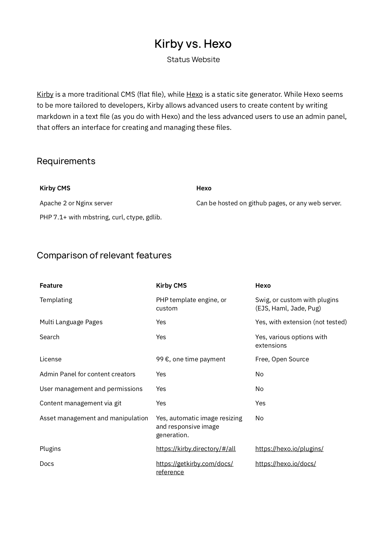
We currently use Hexo across all our docs sites. @ivomynttinen has suggested we use something like Kirby as it is easier to manage. Find his breakdown below. I just want to ensure we are using something that is open source, easily editable by anyone, provides the right level of structure we need and people are generally comfortable using it.
We will also need to figure out a general structure for the docs site. Will we want to merge all docs together at some point such as Keycard docs, embark docs, status docs…i tend think we should keep them separate but im not a dev so not suited to make that call. Stripe does a really nice job of listing out all their product docs in a super easy to navigate manner.
see the WIP designs from Ivo in the link above.
Anyone willing to help me with this? Docs is such an important part of onboarding new developers which is something we will be trying very hard to do over next few months (cc @j12b)
Happy to help with copy review, if needed. One thing that jumps out: under get involved: it should read “open positions” not “open position”.
Given the impact that “trending repos” can have in driving new contribution, have we considered a CTA to “star our repo”? This could sit either in the relevant contribute section or developer docs section…
Re docs in particular: By default, I’d rather we keep the current setup as it’s the first one that devs actually use, which is the most important thing about docs. This is after perhaps 5 different docs stacks, so it’s not the first time we’ve been down this rabbit hole. The simplicity of the setup is also an asset, e.g. that it isn’t dynamic and require some external server setup.
It also does provide ‘user management and permissions’ and some form of ‘admin panel’ (yaml/pull requests) by outsourcing this decision to git and Github. This means we get all the security/workflow benefits of Github.
I don’t think having to write markdown is a very strong argument, since (a) most users are devs (b) markdown is super easy to use and preview for anyone.
As to asset management and quality of multi language support / search I don’t have any specific insight, but it either seems solvable or not like a deal breaker to me.
Regarding owner of docs, I think this should be the responsibility of each (major) swarm. If we want to make sure they have a certain polish (though some doc is better than zero), we can introduce QA/copy as part of PR flow for new docs.
Agreed re:docs. An added benefit of Github docs is the peer-review and outside-contributor aspect which is tremendously useful in some contexts, not to mention the fact that you basically get an easy-to-consume versioned database of documentation that you can then easily render in any kind of front end by just pulling from Github, rather than depends on a CMS’ preferred format.
Thanks for the feedback guys. I hear you and if the docs are currently working, then lets not change it (especially if you have already this discussion). Once again, Im not a developer so leaning on your input for thee types of things. We will move forward with Hexo and maintain existing structure, simply re-skin.
@ivomynttinen - thanks for latest round of designs - App Download & Get Involved
App Download - This page needs to be way more utilitarian. CTA’s need to be above the fold and as prominent as possible. Design is far less important for these pages as they will serve as landing pages for campaigns and need to be optimized for conversion. Check out the Whatsapp Download Page
Get Involved - I prefer to have individual pages for each section. It will be easier to scale the content on these pages and also drive direct traffic from social campaigns.
Get Involved Landing Page:
can we introduce a consistent “sub nav” across the three pages. Looks like you have introduced it on the sub pages. Also I think we need to make the CTA’s more prominent.
These pages need to be super utilitarian and have clear and prominent CTA’s. Maybe we bring the 3 boxes below up above the fold
I also need to re-think the exact content of the boxes. Looks like too much copy and we need another CTA for each for more actionable steps (i.e. direct to Github for Devs)
Development:
After seeing this in layout, we need to group the content a bit more. For example, the primary goal of this page should be to push people into Github. We should group content that drives into github (i.e. beginner issues, status-react, status-go, etc). I need to restructure this. Sorry
Educate: Same as Development. I need to group the content to make the information a bit easier to understand and more actionable
@ivomynttinen - i like the footer and mobile nav. The new app download page looks great.
I also really like the “nav” on the get involved section. How do you foresee this translating to mobile? Also - the new developer layout looks really nice. I really like it and will start refining copy now that we have layout down. Nice work
@j12b have a look at the latest “Get Involved - Developer Page” design.
Priority for this page is to drive people into Github. IMO this page should not need to go into too much detail about the repo’s themselves or the tech (if someone has made it here they are likely familiar) and instead the GitHub readme should provide this level of info. wdyt?
For the “Open Issues” Section - how do you feel about this layout?
We can play with CTA’s on the page and see what performs better. (i.e. “View the repo” vs “Star the repo”)
@Hutch - take a look at the “Get Involved” Sections and please leave any feedback here. Def want your eyes on this. I think the “Commnuity Group” sections will be cool and we can launch with the Ambassadors group. We can set up a public channel and encourage ambassadors and those who want to become - join the channel.
Homepage, Features, About Pages nearly complete. Just need final UI assets. Designs here
Security Page - being reformatted to account for more content and ability to add/remove more content more easily. A simple list of security features linking off to editable hackmd docs.
Contribution portal - @PascalPrecht is weighing in on the developer portal and it is currently being re-structured to present onboarding mechanisms in a cleaner/simple manner. Have a look at the proposed portal wireframe here (feedback appreciated). Some notes on developer contribution page:
Designed for 3 audiences:
Contributors - People that actually want to help working on the Status app. These people need guidance on how to set everything up locally so they can work on stuff. This includes running the app locally, running tests, troubleshooting etc. They also need to know if there are any contributing guidelines they have to follow. This includes commit message conventions, code styles etc.
Extension Developers - This group of people actually wants to use Status as a platform and build something on top of it. Depending on what APIs Status has to offer here in terms of being a platform dictates what content needs to be created here. Either way it should be discussed what is an “extension”, what comes with an extension, how do I build an extension, what can I do with an extension (and what not) etc. So we probably want to have some guides on this and on top of that an API reference.
Tool/Ecosystem Developers - Considering that there’s e.g. a status.js library, there could be a target group that actually builds other tools using those libraries that Status happens to use itself. A good example of this is the web client, or StatusX built by Iuri & Co. People that want to build their own tools are neither contributing to the App, nor are they building extensions. But they might end up building their own Status app with available libraries
@Hutch, @Warsoverjohn1, @daoking, @BrianXV - would love your thoughts on the Educators contribution portal. This page is intended to be a hub for all resources someone would need to start educating others on status. Wire also here. Maybe we can collect some feedback and thoughts on what the ambassadors would like/need in this page
Great sounds good to me, will review this ASAP and give feedback this week; also pinging @yalu@tbenr@tomnash and @krisc who are heading the Dev Rel / educational parts of the ambassadors so far and doing some really great work.
 ). If you would like to help translate the site into your own language, please let a brother know and let’s make it happen. Big thanks and kudos to @Chad for helping make that happen.
 GitHub - status-im/status.im-partials: Global parts of the Status web presence which are shared between all sites