Window Based Navigation

Hey. Some of you might have noticed the video Jarrad played during his Istanbul talk, the one with 3D cards floating around. This is a project we’ve been calling Window Based Navigation, it’s been live as a concept car for some time now. Since then I was asked by many of you to shed some light, what it is, why did we do it and how it came to be.

What is Window Based Navigation?
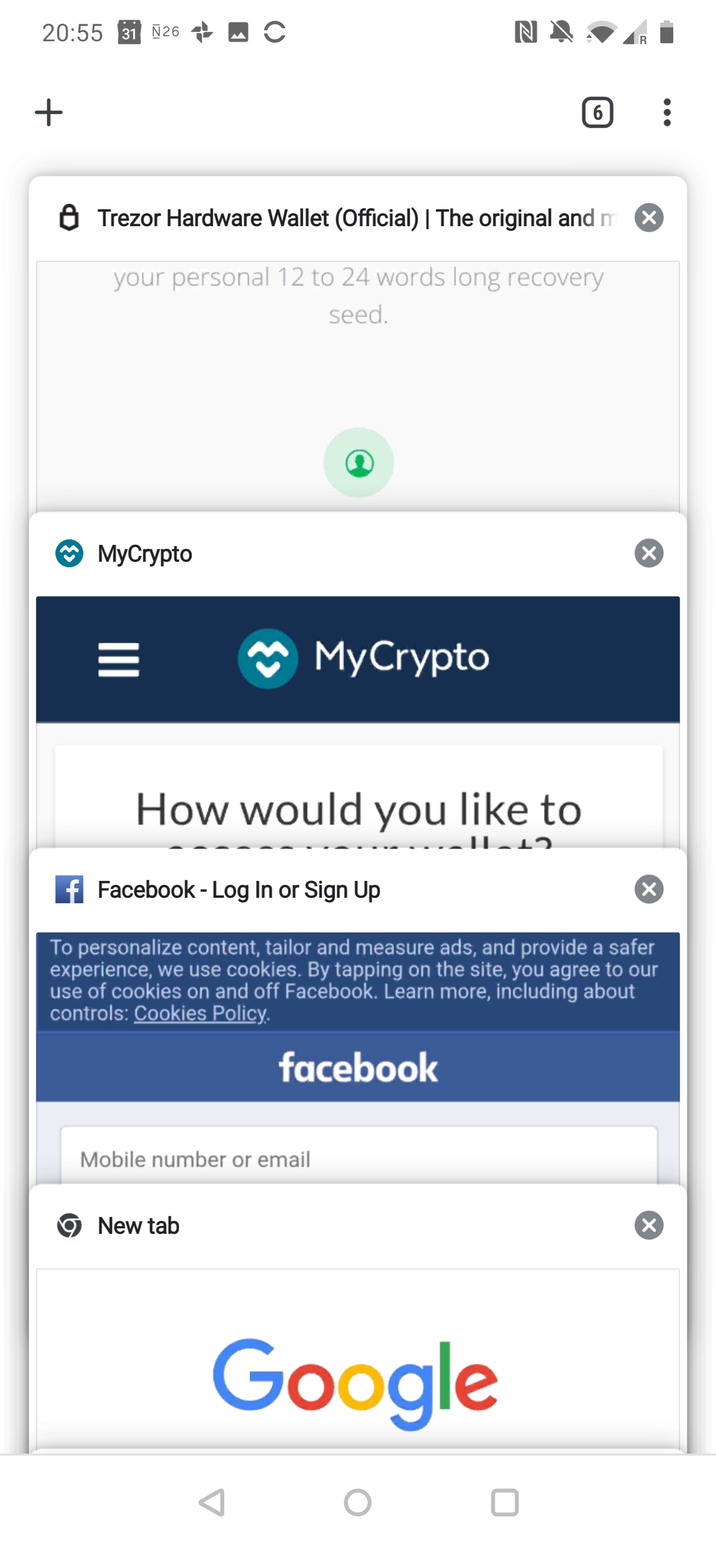
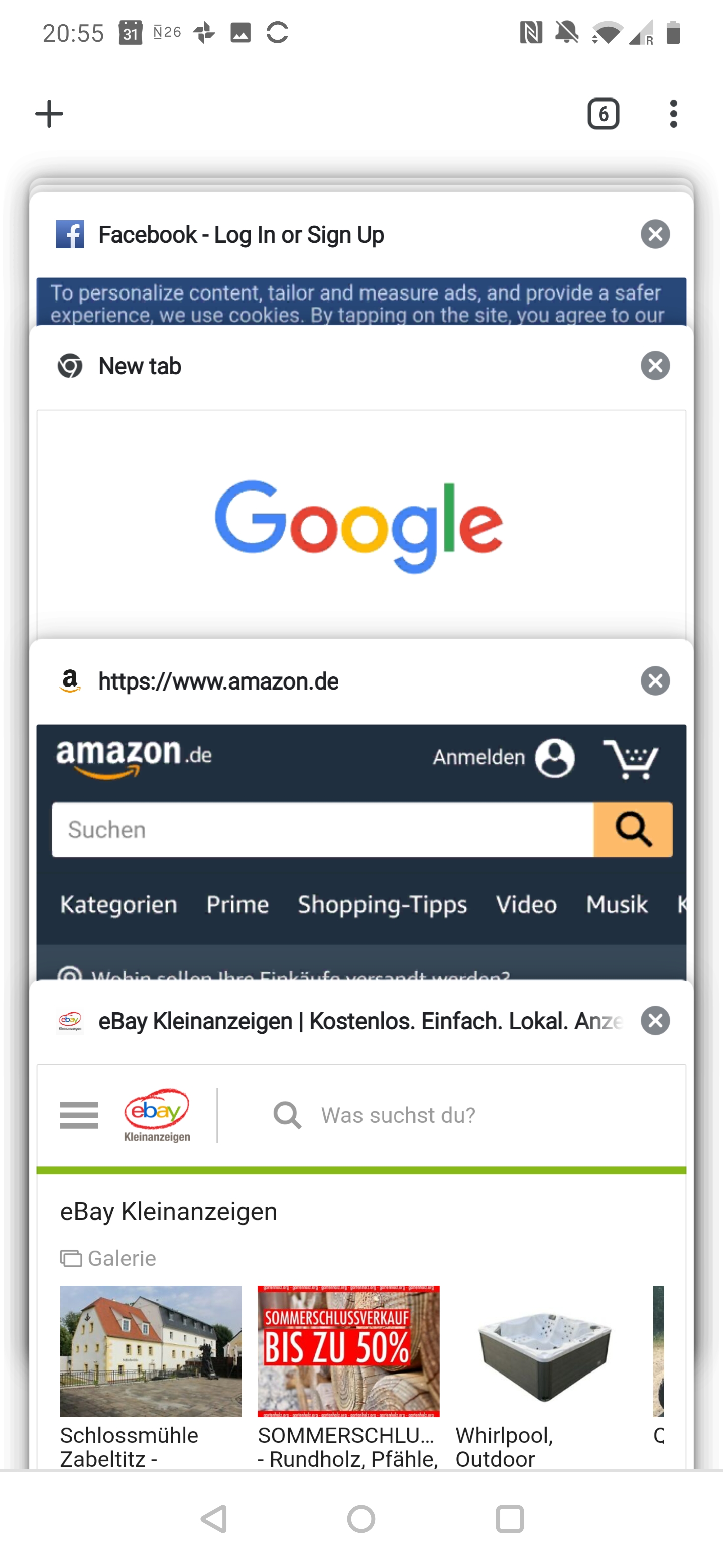
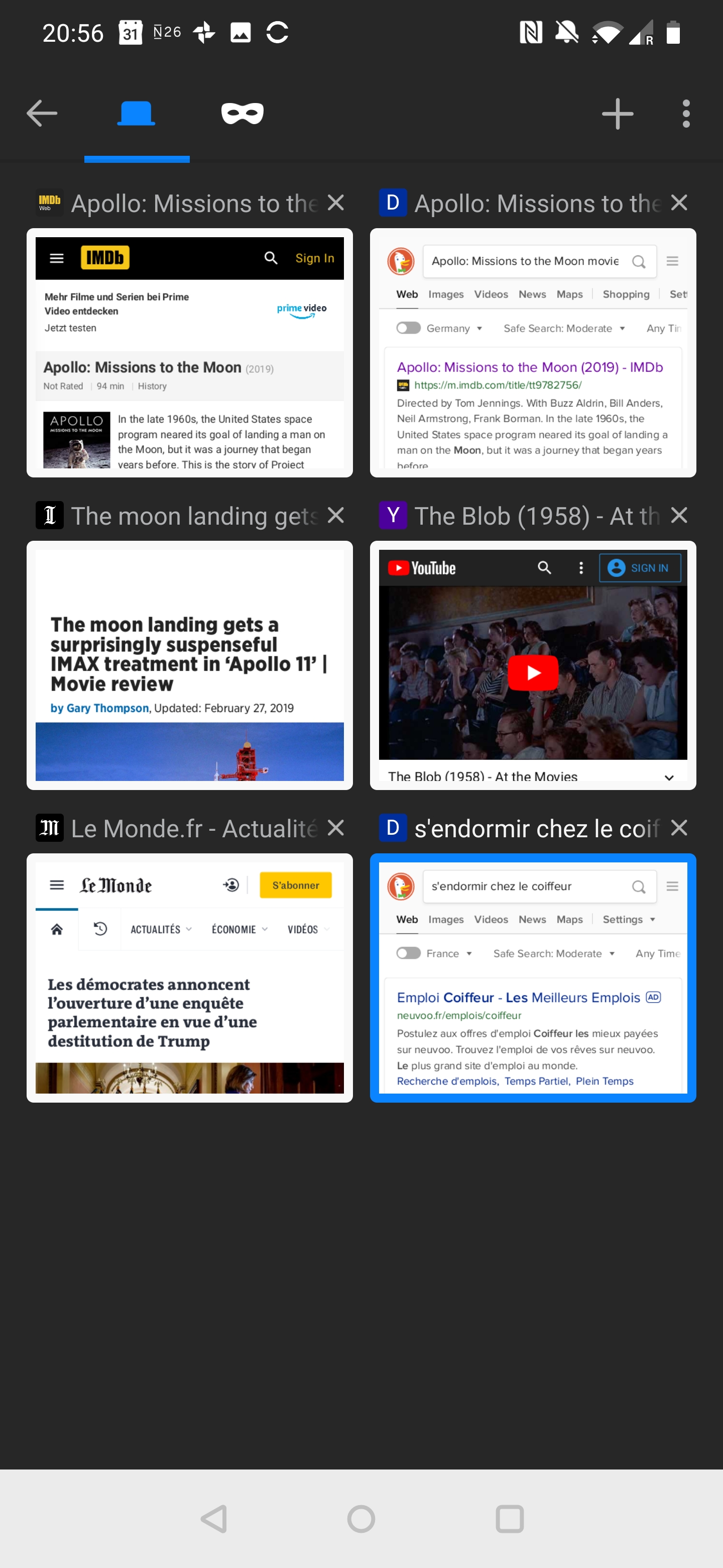
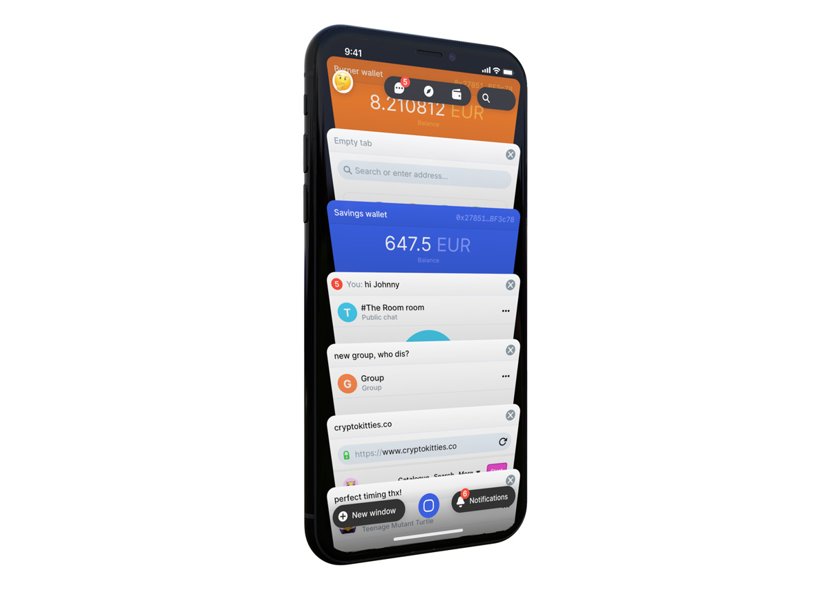
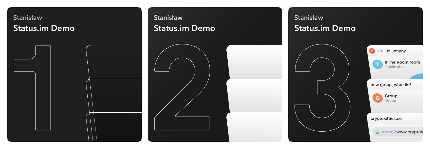
It’s a new interface to glue the different layers of the mobile app together. It’s about presenting each instance of chat, browser tab and account as a separate window. You navigate windows in a multitasking interface resembling a deck of cards. New cards can be added here, regrouped and removed.

There’s also the blue button
It’s always there to bring up the multitasking interface. But it doesn’t stop there, it has some superpowers of its own. Dragging outward from the button will display your three most recently opened windows, if you release your finger while placed on any of them, it will replace the currently active window with the one you choose. It sounds quite complicated, but actually when used, it’s one of the most intuitive ways of multitasking your current activity.

Why did we design it?
Most of all, to level the playing field between Dapps and features built natively. In my opinion, the current design favours the native approach, leaving Dapps to a siloed space with subpar ux. We’ve made an improvement giving Dapps their own tab but that’s still a far way to go from a future where Status can be used as an operating system to interface with the decentralised web.
It’s also more seamless and efficient to navigate from point A to B along a path that’s easier to understand and anticipate. Did I mention it’s cool?

How did we got here?
Jarrad kept insisting on this idea of window based navigation from as far as I can remember but it wasn’t until the talks we shared within Core about how we get to decide to build something as a Dapp vs doing it natively, that I kicked off work on the first prototype. It wasn’t much, a single mothership of a list that you could filter. I didn’t like it, in hindsight I was too careful not to introduce new UI or try out ideas I deemed difficult to implement.

The project was then shelved for 3 months, it was clear to me it needed a different perspective. A three dimensional one, which occurred to me while browsing through mobile multitasking UIs dating back to webOS and Palm Pre, a revolutionary interface far ahead of its time. After trial and error I settled on a vertical representation of windows in a 3D space, one that’s not unlike mobile Safari.

I made the second prototype, then shot the very same video you guys watched in Istanbul and sent it out to Jarrad. He liked it, kind words were spoken and what followed was a story of building it out as a proof of concept in React Native. I believe this part would be better told by someone more familiar with the matter than I am :slight_smile:

How can you test it?
You can download the latest Android apk from here
If you’re on iOS, I’m not sure if we can share the Expo user profile freely, in the meantime DM me and I’ll be able to share them.

You can try out the latest prototype I made here
You’ll need a desktop browser.

11 Likes

I thought this was super cool @maciej and @jarradhope. :clap:t3:

I’m impressed that we went from the mention of a multitasking window based navigation to a full-fledged prototype so seamlessly.

Why did we design it?
Most of all, to level the playing field between Dapps and features built natively. In my opinion, the current design favours the native approach, leaving Dapps to a siloed space with subpar ux.

And DApp discoverability has historically been low.

What are the ideal next steps coming out of this project, from your POV? Is there anything we can take away from the experiment with RN and apply today?

1 Like

Sorry to butt in, but I have to ask: do you have any concerns about making this fit inside each platform, given that there are Human Interface Guidelines that might as much as forbid this sort of pattern on iOS?

2 Likes

No, no concerns at all. I know those inside and out, it would have to be blocked on the ground of Apple not wanting a similar visual metaphor as they use. That’s not HiG, which also in itself does not explicitly forbid things but rather offers guidance. But let’s just assume they do mind that in review, we replace the 3d rotate transform with a scale down and end up with a more timid but already tried and tested interface found in apps left and right.

What are the ideal next steps coming out of this project, from your POV? Is there anything we can take away from the experiment with RN and apply today?

Hard to say really. I’ve yet to observe the kind of performance coming from the React Native implementation that I would find acceptable for it to be considered an alternative. That’s the scenario I was shooting for, that this prototype can make its way into the product in its entirety. From a design POV, it’s a concept car and lessons learned here will inform many future designs to come across the UI. On the RN engineering front, I’m not in a position to answer that.

1 Like

I really like the filters and quick switch shortcut ideas.

Regarding the effect I am a bit more skeptical, I find the deck of cards effect of Chrome to be close to perfect already, and extremely fast on Android (I can slide through hundreds of windows easily), and while it only support one kind of special gesture (left/right to delete) we could be more creative with an option panel or something, based on the type of windows.

!

Firefox is very disappointing in that regard, I’m forcing myself to use it lately and their tab navigation sucks.

In any case I am totally on board for the deck of card concept it’s brilliant. We just have to make it more usable than a glorified browser history.

2 Likes

I definitely think that having something like window management is great for context switching, when talking to multiple people for example, but I agree with Eric that a simpler effect would probably be more readable. The 3D is neat but probably overkill.

But really cool work anyway.

1 Like

Thanks Eric! That’s absolutely fair and I don’t expect this exact take on window management to be gospel. The reason for the added third dimension, I really enjoy this idea of physicality it implies. There’s almost this illusion to it that you’re carrying a collection of physical objects with you and can manipulate them. Done right, without any lag that would kill this illusion, that’s powerful.
If we were to remove that and end up with something along the lines of Chrome you mentioned there, I imagine we’d be able to squeeze a little bit of extra performance and that’s the bottleneck right now. I have the bandwidth to prototype that, depending on where we move forward with this concept, I’d definitely want to give it a shot.