Brand Identity Design Platform – Proposal

Brand Identity Design Platform – Proposal

What is Brand Design?

When stating ‘Brand’ we refer to the perception we as a organization show the world.

When stating ‘Branding’ we are referring to the practice of actively shaping a distinctive brand.

When stating ‘Brand Identity’ we are referring to the collection of all brand elements that the organization creates to portray the right image of itself to the community.

Brand Design functions as a container to listen, evaluate, build or adjust to create symmetry through ideas, language, design and tools for the organization. This ensures everyone has the tools or elements they need to continue and grow.

Brand Design is not one discipline, It is not only not graphic design. A brand design team within a global organization could consist of but not be limited to : Graphic Designers, Developers, Engineers, Product Designers, UX/UI, Copywriters, Interior Designers, Architects, Art Directors, etc

The goal with a multi-disciplinary group is the ability to think as one unit together and communicate in a variety of outputs whenever needed.

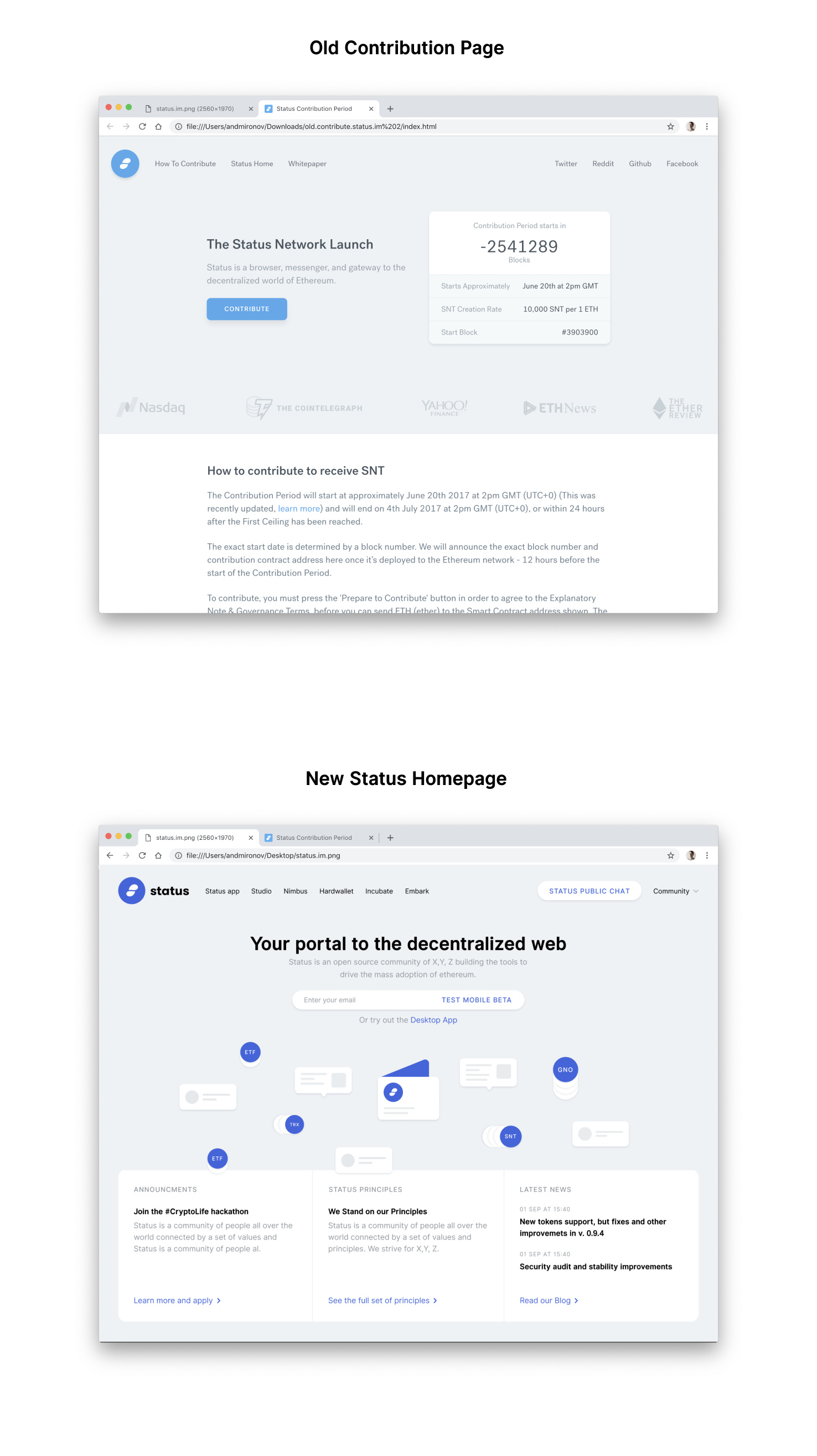
This proposal is an example of how brand design would begin to think about approaching the scalability issues with visual examples.

What Is Brand as Interface?

Some might say that brands create identity through consistency, which creates trust. Sounds logical, but brands are not logical, they’re emotional. If you see a brand as an interface it allows you to explore the notion of brand experience being user experience. People don’t analyze usability, they enjoy it or suffer through it. Good usability means not needing to think in order to act. Strong usability, simplicity and a clear focus automatically lead to a strong identity.

Branding shouldn’t be pretty, it should be strong. Even anti-design or agnostic visual design with consistency in approach still creates a strong ‘branded’ sentiment.

Our interfaces, apps and website are our ‘brand’ and should reflect our principles and how we are constructed as an organization. Simply put, what you see is what you get.

The Future of Visual Design

Moving towards a DAO model we should consider sacrificing legacy design models and current aesthetics for maximum accessibility, functionality and neutrality. We should also be mindful and consider a minimalist approach in which the strongest elements survive not the most beautiful.

Our design choices should be based upon our principles at Status, which many of us have cryptographically signed, give us a path to follow and are being disregarded. Since we plan to slowly migrate to a decentralized platform we should consider and test these parameters and find our visual symmetry together.

Mobile, Desktop and More

Shouldn’t all the Status design language, fonts and visual identity start from our principles to which we agree on and build further? As we create more products and offerings it’s fundamental that people can move from one experience to another seamlessly understanding one design language.

Proposal

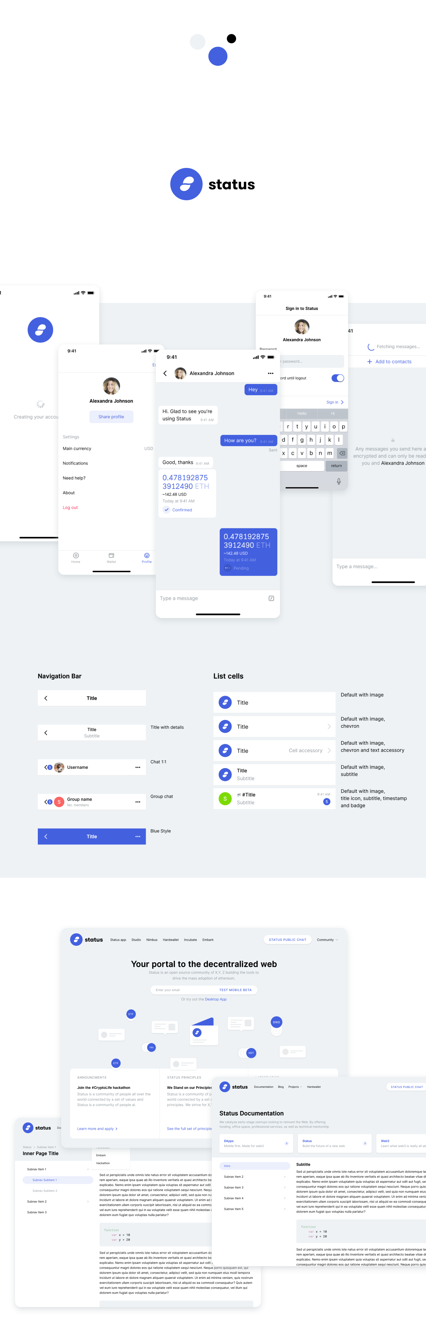
One Visual Brand Material UI Exploration based on the Design Principles

(Sketch File or PDF format)

A Connected Brand Exploration can be found here

Prototype of design behaviour here

We propose to evaluate and explore the following:

  • Revisit the original intent of this project and apply like-minded design approaches to reflect and reinforce that thinking.

  • One Visual Brand Design System

    • Open Source Status React Material UI Library integrated with (Storybook or similar) That show live viewports and customization. Achievable with Bounties for each component to maximize efficiency (This is where design and development meet with one language) See Example Here created by Barry.
  • Figma is a tool for designers, not a solution for universal components in which designers and developers work together.

  • The style guide which has written documentation originating back to our principles which is aligned and considering each discipline within Status not only for design.

    • Product design should not be responsible for the entire brand design of Status, it’s just one part of many in the organization.

    • Scalable meaning anyone new to the Status community can understand and use our tools and language to continue expressing themselves.

    • Design guidelines and principles documented that have been considered for leveraging each aspect of Status not product alone.

A logo study

That fundamentally embodies this organization and what it stands for now and for the future: (See a concept framework design here)

  • communicating a platform upon which other products are built (container)
  • a symbol for multi-dimensional views of our principles
  • functions as a visual behaviour users can interact with as a tool

Trade-offs & Practical Considerations

  • Creating a new language takes time and more understanding of all the needs across all our offerings to create maximum scalability from a top down approach rather than from the bottom up.

  • A design system requires agreement on our fundamental principles and their visualizations from all of us not only design

  • We would only be shifting language for a small amount of our current users in exchange for asking ourselves harder questions now and having the right solutions for our future audience.

  • We can save ourselves time and resources by not ‘designing as we go’ and everyone has the access to tools they need to build.

Reading below goes deeper into the specifics and written examples within application


Designing to Design Principles

Our interface should reflect our principles and be apparent across all offerings. These are some sited examples I have chosen to explore conceptually as a framework. The dream is that Status will lead and simplify an open source design system for our entire community, not only our own products.

1. Reading Data - Transparency

clarify which data comes from the Blockchain and which doesn’t

  • Clarify the address of the contract(s)
  • Link all Blockchain data to independent Blockchain explorers
  • Clarify which data comes from oracles (Transparency of Code)

How?

Use css to change the color/font/shape to clearly distinguish Blockchain data Obviously try to be consistent across your project and use always the same “Blockchain color”

  • use expandable references
  • manage styling conflicts with link-icons
  • Use a “Chain-view” mode and/or side panel
  • Clearly show which links open the external Blockchain explorer

2. Writing Data - Transparency of Transactions

Transaction Data and Costs

  • (Permanence) clarify actions that are irreversible (all writing Txs)
  • (Value) clarify actions that involve money or value
  • (Privacy) clarify actions that could potentially lead to user identification
  • (Factor) clarify actions that generate new contracts in the users name

How?

Use css to indicate all irreversible actions

  • use double confirmation

  • Also offer the user to:

  • Cancel the action

  • Never show these pop-ups again (because she is an expert user) and when doing so tell the user that she could eventually reactivate the feature in the Chain-View side panel.

  • Clarify & anticipate future expected steps

  • Either with tiny written descriptions, label subtitles or with wizard like flows which have more steps to accomplish an action.

In the case of wizards:

  • Clearly show the user the number and title of the next steps

  • allow the user to inspect the future screens to understand what is going on and what is going to happen (Newbie Mode), although you should also grey out the functionality to not confuse the fact that she can have a sneak peek preview with the actual action.

  • Add options to the Chain-View side panel

  • The side panel could be the place for many of these warnings as well as offering an inspector into the transactions, defining:

  • The type of transaction

  • The data associated with the transaction

  • The gas costs

  • All other relevant information (Transparency of Code)

3. Push Data - Transparency of Smart Contract Events

Events are the notifications of the Web3 era

  • Clarify and make accessible to the end user all Events, even if they are just for developer purposes

  • Apply relevance: show interrupting messages only for information relevant to the current user, but still allow the user to inspect all Events in a separate Interface

  • Allow the user to subscribe-to, unsubscribe-from or temporarily mute certain Events

How?

  • Have a notification center accessible to the user, this is probably a section in the “Chain-View” side panel

  • use toasts for important messages

  • create filters to select/deselect only certain events or customise

4. History - Accessible and transparent User interaction History

  • Provide a history of all transactions from a given address
  • Clarify where is the history stored
  • Give tools to navigate, search, export, and delete the history cache

How?

  • Similar to the Event notification center, have a User-History tab or dedicated page, probably inside the Chain-View side panel

  • Allow to filter for different type of transactions (value-eth, value-tokens, function calls, contract generating if pertinent)

  • Allow to filter by date, from the beginning or between dates

  • Optional user friendly addition: allow users to add a non-chain note field to the transaction, such as a simple reminder if they want to simply have a human readable and searchable plaintext

  • Search for transactions relating only to specific tokens

Export: allow user to optionally export the data in csv and explore it through other means, again, especially appropriate in case of large datasets

Delete: allow the user to delete the History from the local cache, but of course clarify that the real history of transactions is not deleted neither from their wallet nor from the Blockchain

Import: it makes sense to add an import option only if the Dapp allows the user to add custom notes to each transaction, otherwise the information can be simply reconstructed from the Blockchain

5 . Code & Environment - Transparency of Code

  • Clarify which Blockchain is being used
  • Clarify the address of the Smart Contract(s) that are being used for read and write operations
  • Clarify where code is being run (local vs Remote Server)
  • Clarify the web3 provider / Blockchain node
  • Allow for DIY code execution
  • Clarify the inputs required by the Smart Contract

How?

  • Have a “Code Transparency” page always accessible like the Terms of Service or Privacy Policy pages

  • Add to the “chain-view” panel

switches, filters or options to:

— display, with icons and/or by changing colors, which parts / components have data that is processed on a server

— display, with (the “cloud-to-chain” oracle) link-icons and/or by changing colors, which data comes from oracles

6. Time/Wait Management

  • (Manage the user’s expectation) Clarify at every transaction the average block confirmation time of the underlying Blockchain and the current network congestion

  • (Manage the waiting time) Show liveness indicators during waitig time

How?

As a sequence of UX events a Dapp should:

  • Explain how gas choices will affect their waiting time (∞link.9 Gas Prices and TXs Reversal)
  • show warning about chain specific times
  • Show a progress or waiting icon until it’s not resolved
  • If things are taking longer than normal, show a feedback and potential causes and/or solutions
  • ie: “ it’s taking longer than expected. The network is currently congested.

Here are your options:

  • -> Wait X seconds/minutes more
  • -> add more gas to speed up the transaction
  • -> get notified when done

7. Human Readable Hashes Format

  • show a compact versions of the hashes but always show the initial and end parts
  • allow users to easily copy the address
  • If possible create a system to allow the user to easily associate a custom human readable name or text to the addresses

8. Permanent Newbie Mode

If we want mass adoption of Distributed Applications it means that we need to enable masses of people without any technical knowledge nor understanding of the Blockchain and its lingo to enter the space.

  • Weave in educational information with the normal interaction
  • Provide 2 or more levels of educational content: Blockchain basics and Dapp specific lingo
  • Minimize and increase progressively the amount of new things and concepts that the user needs to learn
  • If possible or relevant, accelerate learning providing the “expert’s interpretation”
  • Don’t Loose the context

How?

Add small subtitles for commands all over the place (and refer to other principles to anticipate what transactions are going to do

  • Learn mode setting

  • Add to the “chain-view” or other parts of the UI, a switch (a “universal question mark” button) that can be turned on and off and enables or disables learning features

  • Glossary pop-up

  • When using lingo that is available in a dictionary, display a link-icon, an icon after the word, that if clicked or rolled over, displays a contextual pop-up with the specified information

  • In some cases, the pop-up should also offer the opportunity to “know more”, which will open another tab or a sidebar in the “chain-view” opened in the glossary tab.

  • Glossary page

  • in the chain-view or in another page entirely the Dapp should provide a page with all the terms, Blockchain and Dapp specific, that are being used in the Dapp itself or that are needed to understand its mechanics. This page should be redirected from the glossary pop-up, not linked directly.

  • In any wizard, it would be savvy to enable fast forwarding to the next steps so you can see what is coming, although all their layouts should be greyed out and disabled until you complete the previous steps. This is a good principle for any ui, not only of Dapps.

9 . Gas Prices and Transaction reversals

  • Clarify what is Gas and Gas price
  • possibly show gas values converted also to FIAT
  • Allow for Transaction reversal

10. Sense of Community

  • Clarify how many other members there are in the community
  • Clarify who are the other members (choose appropriate categories)
  • Clarify the composition of the community (ie sub-groups and their power over the project)
  • The greater mission of the project (if any) and how their participation contributes to its achievement

How?

  • Show especially all information that could be derived by the users themselves by analyzing the Blockchain:

  • In DAOs consider enriching the information with anything that might be relevant

  • Obviously search for the categories that are appropriate and relevant to your project

  • Maybe allow users to choose their own tags, categories, bio description

Next Steps

It is clear that the requirements of “extreme transparency” proposed in these Web3 Design principles, create quite a burden for Dapp developers who are today more focused on solving many other parts of their projects.

Bootstrap like library

It is therefore obvious that there should be a standard toolset that developers could plug and play into their Dapps and maybe interface their calls to the web3 library and get, for free, all these transparency services for their users.
I’m imagining something like a Bootstrap like library for the Web3 era

Independent browser plugin (Extensions?)

Maybe it’s even advisable that there should be an independent tool that does offer users the advantages of the Web3 Design Principles wither the Dapp creator wants or not; a “transparency enforcer” of sorts, that could allow to identify malicious or sloppy Dapps by their degree of compliancy with some of the principles.

In this case it would probably be appropriate to create a browser plugin that injects its code into the Dapp and provides the chain-view functionality and maybe even a quick certification of the degree of transparency and trustworthiness of the Dapp.

Custom Services

Moreover in these principles there are many potentials for services, even commercial ones that don’t yet exist today.


One Unified Visual Language

The strongest theme for the visual system I can find through discussions within our community so far is to create one visual language that unites (represents) developers and designers seamlessly together. Currently within design we already have a difference of views.

By using shortcut the fundamental design needs of scalability we run the risk of seeing and responding to company problems rather than user problems. If a platform’s purpose or product is created to serve as a tool for ‘decentralized’ it must not use hierarchies in its creation.

By designing to these principles is the only way we will create an original design language that is true.

Unifying Design Principles

To unify our guiding principles and the visual aesthetics. I see these as two outstanding schools of thought which haven’t aligned yet, and once considered it’s conceivable that one of two options could surface;

  1. We drastically shift towards pure functionality in order to maximize usage over brand individualism

  2. We create a visual system based on what is acceptable in the marketplace forfeiting principles to appeal to a specific audiences

Status OS

I understand we are not an OS yet. However, if you think about everything that we are creating and what that ‘visual system’ we are creating might look like when applied to all of our current and future offerings (user and programming interfaces) we just might have the beginnings of a new language that we all use together over time. It would be nice to ask ourselves the hard questions rather than the easy ones to show that we have thought about the future of design and its scalability.

On Beauty

Following visual trends of fashion could be seen as a diversion for weak principles. When there is a strong set of principles visualised it will not make a difference which color it appears in, only if it helps a user accomplish their goal efficiently.

The beautiful aspect is the grand design of creating a simple, useful, honest and scalable visual system that represents us as a whole in principles and practice – much like a typeface or an operating system which can be distributed freely and used easily for mass adoption.

Perhaps it’s an auditing of necessities that are required to allow maximum functionality for each discipline and how they work together in harmony within the DAO framework?

  • Visual Design - Evaluation of our brand design elements
  • User Interface - Evaluation of how the design elements work together creating components
  • User Experience - Evaluation of the components creating the story
  • Language - Evaluation of the language we use to tell the story
  • Engineering - Evaluation of how everything works together technically
  • Security - Evaluation of securing us in this new platform

Appendix

(See my initial written proposal here)

  • One brand font encompassing as many languages as possible to enable the speaking of one language as we type, regardless of the mother tongue.

(Status Monad Typeface here (to be be available in 75 languages)

  • Our Interface as our Brand
    • Components we build are considered and behave as our principles do. (i.e Our chat application educates people about the choices they make when communicating or transacting.

(Link to Examples using 3 binaries in a mobile interface see video linked here)

  • A complete audit of all current and future component libraries to be uniform for free distribution in the future.
    • How we interact with the UX we learn what it means to be self aware and trust ourselves and our choices

(Living Style Guide template here)

  • Websites to consistently mirror our products and platforms
    • strengthen our ideals and principles using the same visual components and minimal design

(See my written proposal here and my visual proposal here)

  • Short term iterations for long term strategy of one cohesive design language.
    • Consider what it means to be design agnostic.

All UI Design principles sited from herestrong text

7 Likes

I like this direction and the initiative a lot! Especially encoding things like Transparency in app interactions.

It’s a lot to take in and think about in terms of specifics, so I’ll start with some questions:

Few questions:

  1. What do you see as the next steps?
  2. What specifically would be most useful in terms of feedback?
  3. Is there a way we can gradually start to introduce this into the app (new screens or element X in all screens), starting with the most high impact/principled ones?
  4. Is there a a plan to do UXR to see how some of these proposals (visualizing block time e.g.) will be seen by end users?
  5. How does this effort relate to the UXR working groups?
2 Likes

What do you see as the next steps?

  1. Hear the feedback from our organization about building a design platform (one design language)

  2. Ask ourselves ‘What is the end goal for everything we create as a brand? Can we build all that with the visual tools we have now?’’ Are we moving in the right direction?

  3. Evaluate this ‘end goal’ as far possible and think about building a design system that could always be foundational to its continuance, knowing it will also need flexibility.

  4. Find a natural consensus together

  5. If there are different options, Let good ideas compete, and try think of ways how the winner can be determined. (Voting with SITG?)

  6. Setup a working group in the #Brand-Design or #Design-system e.g. I’d like to explore the ideas outlined here further with a group of you, to commit X time

    • Ideally, one tagged member from each discipline to understand and decide how choices may impact their group.
  7. Create a timeline and build (implement gradually or tomorrow)

“My mom always says there’s no time like the present.”

What specifically would be most useful in terms of feedback?

It would be most useful in hearing what our core contributors and community would benefit most from in a brand design system?

Ask ourselves if it’s useful to have a system that has been considered to streamline output across all offerings into one design language?

Should our current products look disconnected from the future design system?

What is good and bad about our current visual design system?

Is there a way we can gradually start to introduce this into the app (new screens or element X in all screens), starting with the most high impact/principled ones?

This would be up to Product Design and UXR to adopt this frame of mind. To introduce these elements in the long or short term would start with creating an agnostic material kit UI. I would focus on building a generic React component library into an accessible platform that includes developers.

The ideas for UI/UX came from talking to people and finding a truth in what we want to achieve as an organization and ultimately giving it to people. My conclusion was for the future ‘Status creates tools to free and empower everyone in a connected world.’

Is this our intent? Cool. Do we do that now for ourselves?’:thinking:

Is there a a plan to do UXR to see how some of these proposals (visualizing block time e.g.) will be seen by end users?

UXR is already onto these ideas but what I think is the need is first a generic material library and a POV from Devs on how this takes form and works together with design. Not only design determining what everyone else gets to use, it should be a conversation that both parties understand.

How does this effort relate to the UXR working groups?

I think by building and testing some of these ideas we could see if users will start to get an overall sense of our brand purpose, our goal for them, not only through this application but all future ones, it gets people excited about what we will do next. Ideally… That’s the power of Status giving people a belief or a shared purpose, not just a product.

“Ohhh! Status is giving us tools to understand self awareness and become conscience of our choices and the implications. This is enabling me to be autonomous in this new world. This is powerful shit they are building, it’s not just a chat/wallet like all the others.”

1 Like

I just want to highlight some critical points for me as I mull over all this:

Those stood out the most to me, and I really appreciate the thinking behind it. I have really been struggling. Having asked for a simple design for our docs site over 2 months ago, I still don’t really have one. This, to me, is hard to accept because it effects my OKRs and has added a fair degree of frustration to my work over the last while. It would be ideal if we had such a simple, scalable design framework which I could pull easily from various templates/components and build what I need quickly without having to consult 10 different people with different ideas about how things should be done.

What you build must count more than what you say if decentralised organisations are ever going to be effective and productive enough to drive mass adoption of these technologies, and our design framework needs to be the first step in making that easy for as many people as possible.

Some minor disagreements:

I quite like Figma, and it does make developers lives a fair bit easier. I think Framer might be even better, if we ever get to a place where we are just using React components everywhere. For now, though, I do also like the storybook proposal linked above, and def think a place for engineers and designers to work more actively together than Figma would be nice to have.

I like that you have re-used a lot of stuff from Beltran and web3 design principles: figuring out how to best co-create with the whole ecosystem is going to be critical to building a properly scalable system.

I totally LOVE this:

Would be very willing to help you set up a swarm for this once everyone has reached at least some consensus.

3 Likes

Thanks for sharing Ned. While I don’t exactly align with the outcome you’ve arrived at, the ideas themselves are absolutely sound and necessary. What I - as a CC and designer working with this - would expect from you is to carve out some time and sit down with Andrei and try exploring possible solutions that retain some of our current DNA. Outcomes that align with the vision you’re proposing, but take from the experience of you both. I really do think Andrei can give you valuable insight into how he arrived at our current visual design system and how it can be scaled to suit the needs of identity. And I believe we can make it work, we just haven’t tried yet. What I guess I’m saying is, don’t tear down this entire house to achieve your result.
We’ve also already started working on a component library, everyone is welcomed to participate in the #design-system slack. Since we cannot commit to it fully with our time, it’s been slow to kick-off but we’ll get there.
My other question is, the work we’re doing now with the UI and component library, when the pieces finally start to fit into a bigger picture, when patterns emerge and we’re agreeing on some really good UI/UX design, will all that be replaced by whatever is the ‘new’ visual design identity?

1 Like

“What I - as a CC and designer working with this - would expect from you is to carve out some time and sit down with Andrei and try exploring possible solutions that retain some of our current DNA. Outcomes that align with the vision you’re proposing, but take from the experience of you both. I really do think Andrei can give you valuable insight into how he arrived at our current visual design system and how it can be scaled to suit the needs of identity. And I believe we can make it work, we just haven’t tried yet. What I guess I’m saying is, don’t tear down this entire house to achieve your result.”

Let me be the first to stay I am not a product designer, I am only evaluating the whole brand toolkit to date focusing on how this can scale to many other aspects consistently, and provide a way of thinking, not final solutions.

My intentions are not to tear down the house, my intention is understanding how it’s built and how we might be able to scale it by sharing the blueprints with others enabling them to build. What I am proposing is to invite you guys to own this process from a Product Design POV meaning you would have to create less, empowering others to use your tools (The same for all stakeholders). But to do that we need to evaluate the foundation and see what holds.

“We’ve also already started working on a component library, everyone is welcomed to participate in the #design-system slack. Since we cannot commit to it fully with our time, it’s been slow to kick-off but we’ll get there.”

I understand it exists, what I am interested in are the principles of the design that has been used to create this component library. Is the agreed philosophy that of the Product Design Team or us as an organisation? It seems like the house is being built as you go, which I think is realistic. I would just question what is your final goal and the relevance of those tools to get you there? And is that in alignment with the rest of the organization?

“My other question is, the work we’re doing now with the UI and component library, when the pieces finally start to fit into a bigger picture, when patterns emerge and we’re agreeing on some really good UI/UX design, will all that be replaced by whatever is the ‘new’ visual design identity?”

What is strong will survive in the real world.

Whatever we agree on, it has to be together. If we aren’t enabling others with our tools who are we doing this for? The UX/UI is only one aspect of the brand. I had chose to focus UX/UI first as it is the most logical place where audiences encounter the brand. This isn’t an attack specifically on Product Design, I see this as the most fundamental starting point to communicate ‘what we say is what we do’ and this should be applied to everything over time.

If we all evaluate and listen to the needs of the organisation the answers will reveal themselves to us and give us something we couldn’t have created on our own.

Hey!

Skimmed through the text, there are a ton of things that I really like :slight_smile:

One thing that is a gotcha to me is this “permanent newbie” mode. I don’t know how to properly marry it to everything else in the same document, showing very advanced features. It is not a showstopper but that is a very design challenge and it leads to some tradeoffs I’m not sure if we want to make in the current Status app.

Maybe we should have a simplified client or something like that. I don’t have a good answer, it is just thinking out loud.

So much to unpack here! Great content @Ned and questions @oskarth. I see this as a vision of the future and we need to figure out how to get there in practice.

I created a strategy doc for building a design system. https://drive.google.com/open?id=1FhdfcW7rkkelEU4ARN_M5IUE0zFnbJX7laOHnEkzF5U. It can use some work, but to highlight three points of the deck.

  1. There can be a component library and visual language for a Status OS, a derivative of that could be a component library for a status product like Status Core, Desktop or Studio.
    We are working backwards, starting with a component library for a status product and potentially DApps. We’re only humans; this is where we are now and it has a huge benefit of it’s own which is efficient design and production short-term so that we actually will have more time to build out new concepts.

  2. It is imperative Visual Language and the behaviour of components are seperated, in conversation and implementation.

  3. Building a design system for an OS is a massive job that usually requires a dedicated team with PM, design, and dev. I think starting a swarm would be an excellent start.
    One of the reasons I’ve seen systems like this being initially developed by a standalone team is because it requires objectivity and alignment across products and opinions. This means we need to either free people up or hire.

The working groups focus on identity, information architecture, content, and flow. The Visual language is a layer on top of this; Obviously there’s overlap and I’m oversimplifying. This 18-year old model still accurately describes what I mean.

2 Likes

The concept of purpose driven design seems to align well with using OKRs. I think it would be very helpful for a team when a design is proposed, that a write up in one page or less is also submitted that articulates how the design supports the OKRs of the swarm and principles of Status.

Agree with everyone that this is a lot to take in and I hope we are all understanding it in the same way (which i highly doubt as we are all coming from different perspectives and personal backgrounds/experiences).

What I really like about this proposal is the idea that brand design is multi-disciplinary and cross functional. The “brand design” should reflect everything we do and everything we stand for. At the moment, the only thing we have that unifies us across ALL we do are the principles. So in that, I agree we need to start there and build the “brand” or “visual language” on top of that.

It is hard to figure out what ultimately comes next and what is the immediate next step. But perhaps we have to map our principles across all our products, initiatives, teams, community, etc and figure out what, then, can unify all the touchpoints in a visual way. The more I think about it, the more I think an “agnostic visual identity” is a solid approach. An agnostic approach supported by a well thought out framework/container can allow for various interpretations and inputs into the visual language and ultimate production of brand assets and materials (not only visual ones).

One principle I find of utmost importance is Openness. We need to accept the fact people should be able to and will ultimately take what we have created and turn it into what they want. We should provide the tools and framework for them to do so with ease. It is a massive undertaking to do that, and in many cases will be an never ending evolution. So it is important we get the fundamentals right. (I.E. simple and flexible containers which can be built upon)

The team has done an incredible job to get us where we are. We have “brand equity” and tons of thought has gone into everything. Therefore, I think the visual language should be an evolution instead of a “re-design”. I also feel whatever we do should serve newbies and experts alike. In the journey towards the mass adoption of ethereum, not everyone will be as frickin smart as you all :wink: – in fact most wont. Perhaps we can play with some of the concepts above and stress test them against:

  • Highly technical vs Non-technical
  • Designers vs non designers
  • All of our various initiatives (does this system work for the app AND hardwallet. Studio and Advocacy Program. etc…)

In whatever we choose, I would love to commit time to help evolve this.

4 Likes

For the record I am not suggesting a complete redesign at this moment. This proposal was an attempt to share ideas on how ‘scalable design’ works with brands. The goal is to start a conversation and evaluate the current system and to explore things that don’t work together.

I guess the important question is how scalable is the current system? How far are we ‘permitted’ to go with what we want to create in this frame work? And how is this still seen to connect back to Status. This is where I see a disconnect.

Let’s say we continue down this road we are on. And I want to build something like what I have proposed above for Studio. Can the design system facilitate this? Or will I be told that I have to use the Status ‘brand look and feel’? And does this align ultimately with the vision for Studio?

The system should be considered to be free enough to support a number of visual possibilities so we maintain that we support decentralized design. Rather than saying ‘we do’ but impose a rigid design hierarchy onto everyone.

So I would ask:

Can we seek a consensus on Status having a decentralised design framework or not?

Then define what that means and how it works. The added complexity comes in trying to build back this ‘invisible layer’ that unifies everything that the audience still recognises as Status.

Much of this is directly to related and building on the Brand Vision Architecture doc

The boat builder of pirate ships is not sure where the pirates are headed but he will promise that where ever they go, the boat will do its best to get them there.

1 Like

yes, that was the point behind the Team statements proposal, which very few teams / products have completed. But no worry, the links are in that document, and people are welcome to continue to contribute / define how their team / product manifests our principles.

Thanks all for this, a lot of interesting points and ideas here!

iIwould like us to see the whole picture so i would give an overview of the current design language and ask some questions.

Brand - Consistency - Evolution

The brand is the visual representation of our values, our mission, our principles

Keeping the brand consistent across all the mediums means us staying true to what we believe in, visually.

Evolving the brand rather than changing it means that from day 1 nothing has really changed in terms of our mission. We still are building what we have promised to build. We still are aiming to provide the tools we believe in.

The change of a visual language should have strong reasons behind it. Change of a mission, pivot, different direction.

Current Design Language vs. the Principles.

The principles were written down recently but the interesting thing to mention is that they have been here in one way or another all the time (something was expressed in the Status Whitepaper, something was just “in the air” since the team was pretty small). Like any canonical law or language, those principles were born naturally, evolved and written down with time. It doesn’t mean they were any less true before we signed them.

And the visual language as it is right now has evolved with those principles in mind.

Everything in terms of design was made by the internal team, in close collaboration with the teammates and founders.

Limited color palette, bright blue as the primary color (the primary color of hyperlinks in the internet since forever), black text, white background, no shadows and gradients. Clean, transparent, non-distracting. Not over-designed, pure function. All of that reflects the mission of Status very good: providing communication tool for the modern world, making it accessible to anybody who has a smartphone and access to internet, keeping the communication private, secure and transparent.

Evolution of the current visual Language

I think what is missing is the evaluation of the implications of a design revolution. We don’t have a lot of users, yet we kept consistency in mind when making all the design decisions. Take a look the old contribution page and the new suggested homepage one next to another. (Image attached to the next reply) Keeping it close, maintaining the same “vibe” send a message that we are still true to the promises we’ve made to all SNT holders and our contributors.

Logo

The logo was here long enough to consider all the implication of changing it. Along with the visual language a change of a logo means change of direction of the company.

The idea behind that symbol was the interaction and communication happening, it’s the convergence of chat bubbles, Ethereum logo and the letter “S”.

Status logo is listed on dozens of exchanges. We used it across all the mediums: social media channels, t-shirts, websites, app, conference banners etc.

There is a need to scale it to make it work not only for the app, but for many more initiatives and projects we work on now, that it a challenge we have to tackle in the nearest future.

Typography

We used platform-specific typefaces for the app (SF for IOS and Roboto for Android) and Post Grotesk for our websites. This had to be revisited, since having different typefaces for apps created a lot of development problems and required extra maintaining. Recently we discovered Inter UI, an open source typeface created by designers for the digital world. It has a whole bunch of special characters available (such as the slashed zero for example, which is super important for crypto). Besides from that it has almost all possible glyphs available and it’s source code is hosted on Github and currently it’s actively under development.

I disagree with the idea of us having a custom typeface. I think we should rather stay open and use the good stuff community has made. I would even suggest to mention it in the site footer for example, that Inter UI typeface has been used, to pay the respect to it’s developers and show that Status is open to using nice stuff, even if it has been made externally.

UI/UX

A lot of interesting points have been made here and quoted from Web3 Design Principles. A framework of UX rules for Blockchain… | by beltran | Medium This is extremely important to be thoughtful of any product design decision for Status as we have an ambition of creating industry standards and influencing the community.

And we’ve made some progress in it, yet that should evolve as well. Here’s the UI/UX Checklist we use when working on the app https://docs.google.com/document/d/1umbtgnFjcGWwEHBCILKgGqO5H3A72eXxZrmMmhskNzs/edit it indeed has to be revisited, and after that published publicly.

The Status Design website is also an initiative worth mentioning in this context. It was made to show the community that we as a team value design. This makes it more likely for really strong designers to join us, which has happened.

Scale

Status Team in general and Status Design team as a part of it stayed really small for quite a while which made it really easy to stay on the same page and share the same aesthetic and values. We did not need to have documents and specifications to stay connected and consistent, this is a luxury only a small team can afford.

We’ve been lucky enough to go through a massive growth, so many great people who are now on board and we all are building this together now, which can’t be more exciting. Although a bigger team comes also with some implications. We need a lot of websites, blog posts, product pages, swag, banners etc. The design system was not ready for that which created a sensible frustration of the team. The design language should evolve to be able to cover all the needs now. The design team itself is 3 times bigger than a few months ago and is working hard on the component library, website design system etc. (links in a reply below) We want to keep the spirit and values same, yet evolve and create a solid scalable system.

Cant be more happy about this discussion happening, we the design team are really sorry for not being able to move and scale as fast as the rest of the team but let’s make this happen all together!

Followup

The old contribution page vs new suggested homepage

Component library https://www.figma.com/file/cb4p8AxLtTF3q1L6JYDnKN15/Index?node-id=0%3A1

Website design system https://www.figma.com/file/MHMQZfRpQZ6ScJYPYnsvquVY/Websites-v2?node-id=844%3A316

Followup 2

UI/UX Checklist we use when working on the app https://docs.google.com/document/d/1umbtgnFjcGWwEHBCILKgGqO5H3A72eXxZrmMmhskNzs/edit

Inter UI Typeface Inter font family

(It’s allowed only to put 2 links and 1 image in a post here, sorry)

Wow so much knowledge in this thread! How can we consolidate all of this and make it easily digestible?

Agree with Julien— a lot of amazing ideas and nice to see so much innovation happening on the design side. I like the proposal you outlined Ned, especially the open approach. I think an approach like this is the future of where brand design is going—marketing as well. We should experiment and shake things up a bit. Also agree with the point Andrei made about there being a compelling reason for such a radical departure from the old brand—rooted in strategy and I think alignment with marketing would be helpful here- imo we have ignored our branding from a strategic perspective and focused on tactical marketing mostly based on the need to constantly execute. Should be a nice synergy between brand strategy and design going forward…

1 Like

What I would like to propose now is that we can keep this framework and study in mind for the future.

I would like to work on this and be unified and I unable to do it alone. It seems the easy choice in such an experimental organization to decide to branch off due to conflicting opinions. The harder road is to stay together.

In agreement with Andrei, I will begin efforts to help the product design team in testing and scaling the current system for creating brand identities for Embark, Incubate, Statusphere, Studio, PeopleOps and anyone else I may have missed. So lets open this dialogue around what each of your needs are to build out your brands.

How do we start? Join the Status desktop / mobile app as this is the only place I can be found.
Contact Code

Who’s first? Whoever writes me first on the Status App. I have already created the channels for you there and will be waiting with tools in hand. #status-embark , #status-incubate, #status-studio #status-community
@akshifederici @Ben @kim @iurimatias @ShawnS @Hutch @anon16796968

This is where we all will get a better understanding of how Brand Design functions in practice and what we need to adjust slowly for the long game. And most importantly working and remaining together.

1 Like

ned, the channels should be: #status-embark , #status-incubate, please edit your post to reflect that. Here is a full list of channels, please take into consideration the guidelines for starting channels, and remember to update this file when you do so :slight_smile:

Incubate will go first!

1 Like